Bike e-commerce App: Design Case Study
Objective: Build a product comparison widget and guest checkout for e-commerce mobile app to improve shopping and checkout user experience for stationary bike consumers.
Method: This project used Design Thinking methodology (modified for a team of one) to build a prototype for a single user guest checkout flow.
Research
To understand existing mental models for e-commerce user flows, I conducted a competitive analysis of the shopping and checkout flows of four bike retailers: REI, Schwinn, Bowflex, and Spinning. Since a primary goal was to build a comparison table feature and guest checkout, I made sure that these retailers offered both features.
Next, I conducted a literature review of best practice recommendations for guest checkout and product comparison tables, and compiled those learnings into guidance documents to use as core reference materials during my design process.
Lastly I took some time to create a project plan and consider how much time I wanted to devote to each section in order to make the most of my time.
-
After reviewing four e-commerce user checkout flows for bike retailers, I concluded the following:
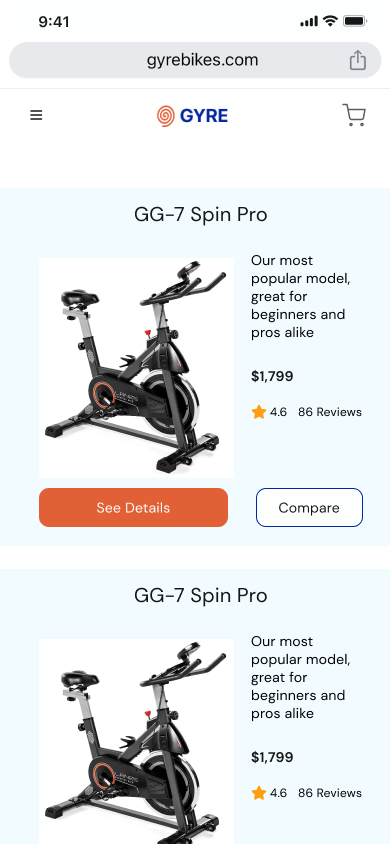
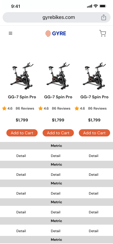
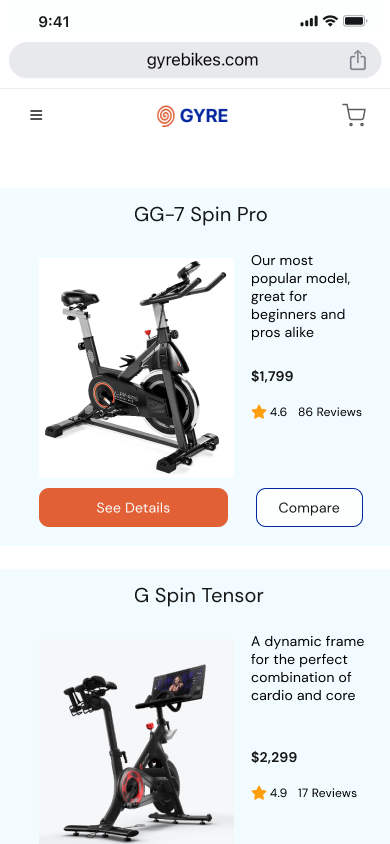
It was uncommon to offer a dynamic comparison table and all retailers offered redundant feature comparison tables that features 20 or more comparable features.
All but one retailer enabled checkout in four steps in the same order: shipping, payment, order review, order confirmation.
All but one retailer displayed a progress bar between checkout steps.
None of the retailers offered a chat option for users to easily ask questions about products.
-
In order to make sure I implemented best practices for guest checkout, I consulted research reports from Nielsen Norman Group, Baymard, and UX Collective and compiled key takeaways into a guidance document to inform design decisions.
-
In order to make sure I implemented best practices for comparison table design, I consulted research reports from Nielsen Norman Group, Baymard, and Smashing Magazine and compiled key takeaways into a guidance document to inform design decisions.
Ideation
I opted to focus my time in the ideation phase specifically on comparison chart development rather than sketching out entire checkout flows for two reasons:
E-commerce checkout flows, including guest checkout, are one of the most (if not the most) ubiquitous and well-researched user flows that exist in the UX space and deviating from the existing mental models with a design innovation would likely prove counterproductive.
In my competitive analysis, the comparison table feature presented the highest variation in design solutions used and the worst user experience in the shopping flow. This suggested that a single “best practice” hasn’t been identified in the e-commerce space there is still room for innovation in this segment of the user flow. I theorized that this could be an incredibly valuable opportunity to develop improvements in the user experience.
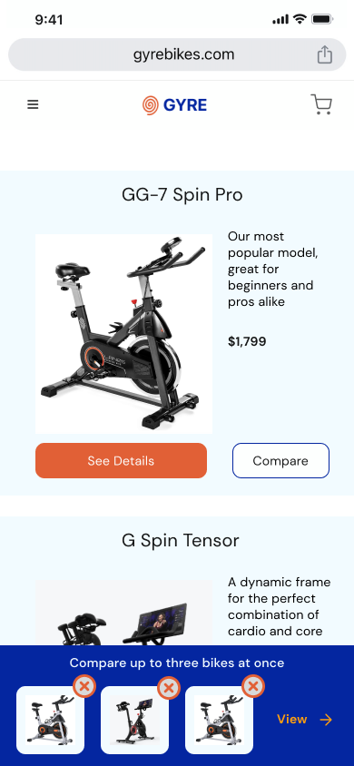
In order to do this, I used a crazy eights exercise to quickly ideate on potential screen designs for the product comparison chart on a mobile interface.
Prototype Design
Before starting my prototype wireframes, I front-loaded the design process by nailing down brand identity and creating a UI kit.
In building my prototype, I relied heavily on design conventions displayed in the e-commerce platforms I reviewed in my competitive analysis. I also turned to the guidance documents to ensure I implemented best practices when designing the guest checkout flow and product comparison tool.


Prototype Testing Round 1
In 10-minute in-person prototype testing sessions, I prompted five participants to complete one e-commerce guest checkout task using the Gyre prototype in Marvel on a desktop screen. I asked participants to infer button and icon actions and give feedback on positives and pain points.
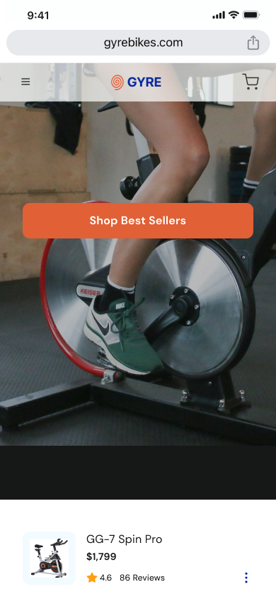
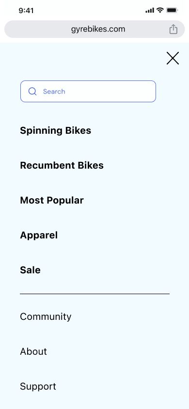
The main issues identified had to do with a lack of information presented in the shopping and checkout flow. Some users wanted to be able to shop for bikes using a hero menu rather than just clicking on the recommendations via the “Shop Best Sellers” button. One user pointed out that they weren’t able to see the total cost of the order until the final summary screen. Another user wanted more information about shipping times/delivery date estimates on the previous screens and the confirmation screen.
Based on these findings, I planned to improve information transparency in order cost and delivery details as well as improving and adding UI elements to smooth transitions and optimize user information processing.
-
Session Structure
I conducted five moderated 10-minute usability tests in-person. Participants were asked to complete one e-commerce checkout task using the Gyre prototype in Marvel on a desktop screen.
I recruited from friends and family for this first round of testing, and didn’t screen for the ultimate target user group of male bicycle enthusiasts.
My research goals for the session were to assess general impressions of the UI and its legibility, and identify any obvious pain points in the checkout process.
-
Can users correctly identify the actions of icons and CTA buttons during the shopping and checkout flow?
How do users feel about the comparison widget? Is it easy to navigate? Is the UI legible?
Do users feel confident and trusting during the checkout process?
Can users quickly and easily complete form fields?
Do users understand where to access information about their order once completed?
-
The main issues identified had to do with a lack of information presented in the shopping and checkout flow. Some users wanted to be able to shop for bikes using a hero menu rather than just clicking on the recommendations via the “Shop Best Sellers” button. One user pointed out that they weren’t able to see the total cost of the order until the final summary screen. Another user wanted more information about shipping times/delivery date estimates on the previous screens and the confirmation screen.
I didn’t get much feedback on the comparison feature and table because it was fairly low-resolution but users seemed to understand how to read it. One user wasn’t sure how to remove a compared item and wanted to be able to filter the details based on what they were looking for in a bike. Another user was hesitant to click on the compare button but ultimately guessed correctly about what it would do.
In general, the users found that the flow tracked with their mental model of e-commerce checkout and were able to correctly identify the icons and navigate the checkout process without assistance.
-
I identified three main issues for users:
Some crucial order details were missing from the checkout flow and raising questions for users.
Product search, comparison and filter options are limited and unclear.
The cart summary was text-heavy and minimal formatting hurt legibility/scannability.
-
Based on these findings, my recommendations for the second iteration of the prototype are as follows:
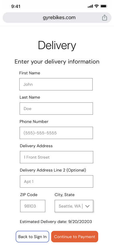
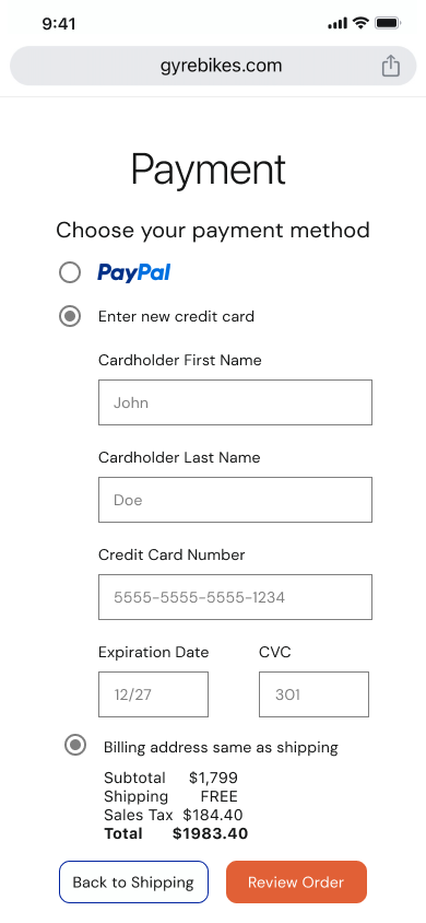
Add details about the order cost, delivery time estimate, and tracking number to the flow and make them more prominent.
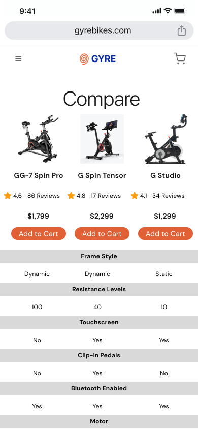
Add filter to product comparison table.
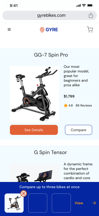
Add a remove/swap button to the product comparison widget.
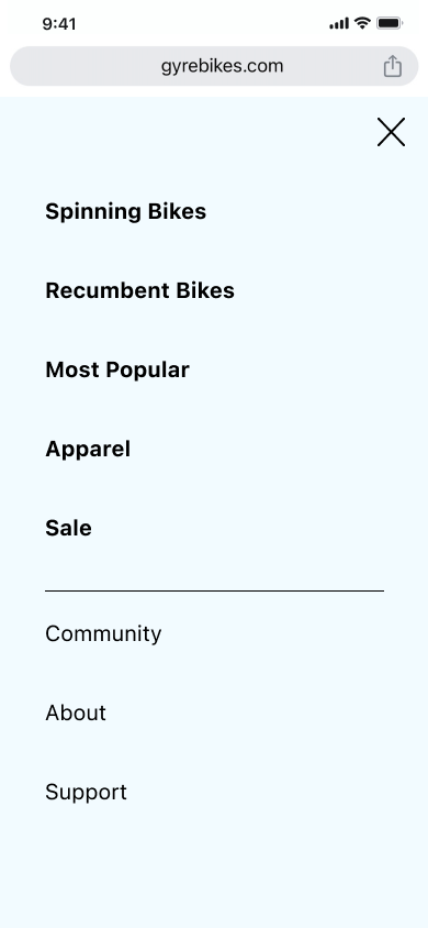
Add product menu to hamburger icon.
Add formatting and more generous spacing to order summary
Update flow following “add to cart” to meet user mental model
Remove badge from cart icon after checkout complete or remove it during checkout altogether


Prototype Testing Round 2
I conducted five moderated 10-minute usability tests in-person. Participants were asked to complete one e-commerce checkout task using the Gyre prototype in Marvel on a desktop screen. I recruited members of the target user group of bicycle enthusiasts in the age range of 24–38 years old with most testers (4 out of 5) being male to reflect the 72% male user base.
My research goals for the session were to assess general impressions of the UI and its legibility, identify any obvious pain points in the checkout process, and determine whether the previously identified issues were solved by my design updates.
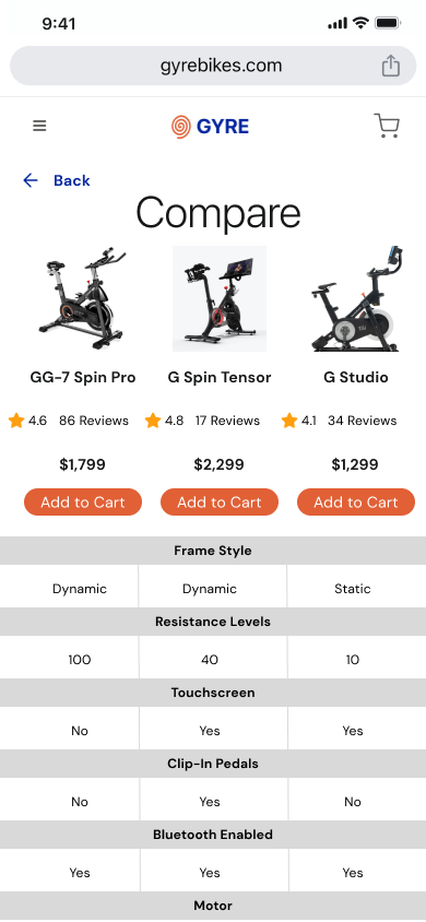
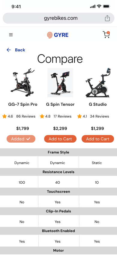
User testing identified several issues with the item comparison table, including one critical error and a few minor issues that could help increase site usability.
-
I conducted five moderated 10-minute usability tests in-person. Participants were asked to complete one e-commerce checkout task using the Gyre prototype in Marvel on a desktop screen.
I recruited members of the target user group of bicycle enthusiasts in the age range of 24–38 years old with most testers (4 out of 5) being male to reflect the 72% male user base.
-
My research goals for the session were to assess general impressions of the UI and its legibility, identify any obvious pain points in the checkout process, and determine whether the previously identified issues were solved by my design updates. My research questions remained:
Can users correctly identify the actions of icons and CTA buttons during the shopping and checkout flow?
How do users feel about the comparison widget? Is it easy to navigate? Is the UI legible?
Do users feel confident and trusting during the checkout process?
Can users quickly and easily complete form fields?
Do users understand where to access information about their order once completed?
-
The issues identified in this round of testing mostly involved the product comparison table. Other areas of the flow were navigated with ease and users felt that the experience was intuitive and familiar in comparison to other shopping flows they’d completed.
-
I identified three main issues for users:
One user noticed that they weren’t able to edit the compared items once they entered the comparison table view.
Another user pointed out that it was difficult to delineate the columns in the compare table view because there was no visible separation.
One user said they typically like to use search on websites to find products rather than navigating through categories. They made a feature request for a “search” function in the hamburger menu popover navigation.
-
Based on these findings, my recommendations for the third iteration of the prototype are as follows:
Add “back” button to “compare” table view.
Add vertical lines to separate columns.
Add search function to site navigation.


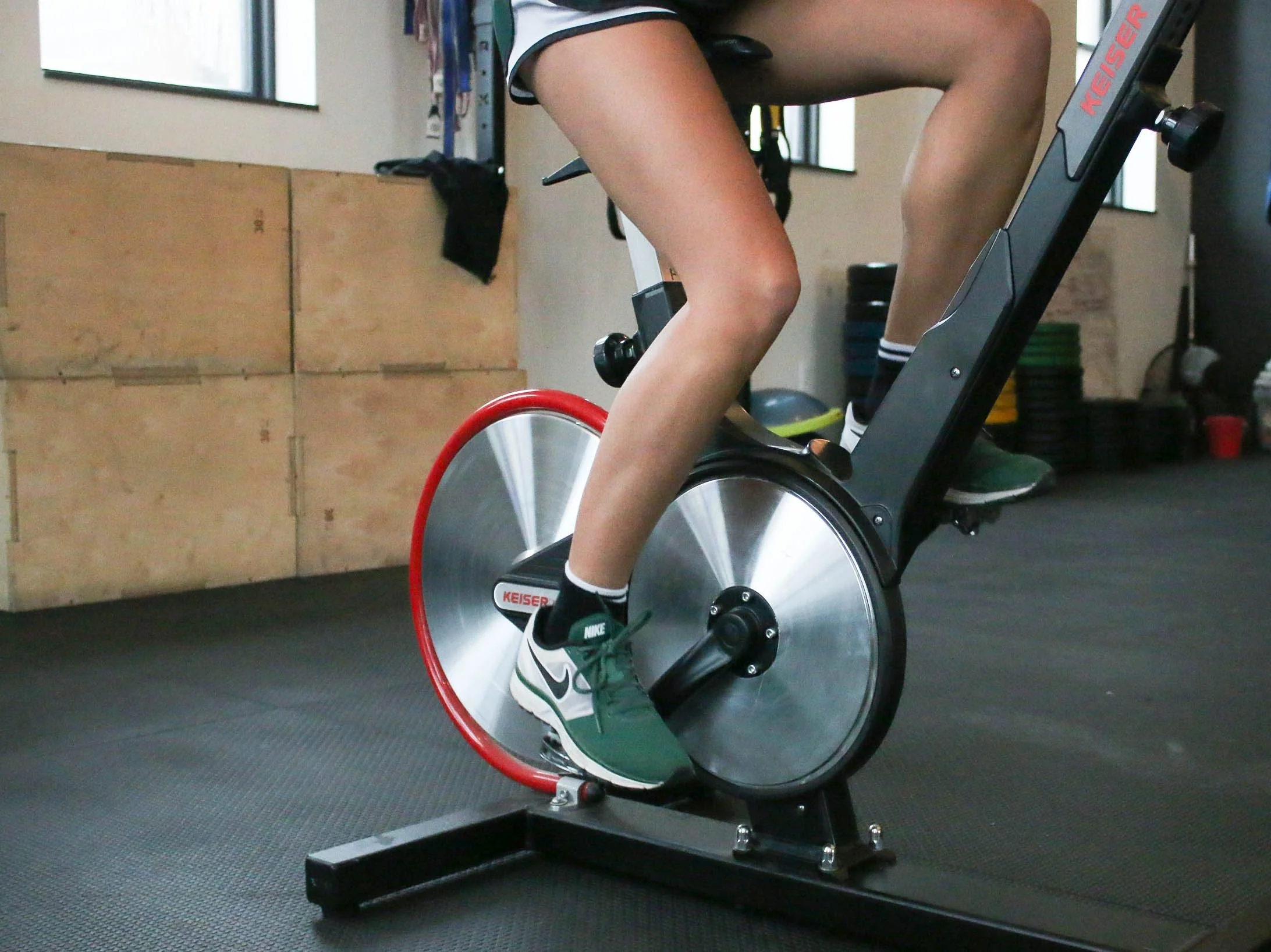
Prototype photography images credit to: Pexels