

Social App Onboarding Flow: Redesign Case Study
Objective: Improve desktop onboarding flow for student users of Nomie, a social app for building community in classrooms.
Method: This project used the Design Thinking methodology.
Role: I collaborated with two other UX designers on each phase of the design process. I also served as the team lead, facilitating communication between the team and the client.
Background
Nomie is a Canada-based education startup that aims to foster community among college students through a classroom-centered social app. Students answer a series of questions about themselves to create their Nomie profile. This profile serves both as a virtual hub to connect with classmates and a basis for in-person games.


Empathize > Define > Ideate > Prototype > Test
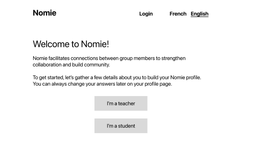
During our initial meeting with client, we learned about Nomie’s mission, product, target users, and goals. They discussed a desire to improve the onboarding UI and flow but did not have specific requests for the redesign. The client emphasized that the design should feel fun, conversational, and inclusive, pointing to Typeform as a UI exemplar.
Role: The team collaborated on the user interviews and the heuristic evaluation, and I researched and wrote the best practices document to inform decision-making in the ideate and prototype phases.
Research
The team conducted primary research with user testing and secondary research using the following methods: a heuristic evaluation of the web app, a competitive audit, and an analysis of relevant best practices for onboarding, form fields, and profile creation.
We were able to confirm many of our secondary research findings with our primary research, particularly the following:
Instructional popups inserted throughout the flow weren’t helpful, either causing confusion or being ignored.
Multipart questions were presented on different screens, with one question per screen. Users felt lost in the process and sometimes had to backtrack to remember what they were doing.
Graphics and illustrations were low quality and felt like afterthoughts rather than enhancements.
We compiled our user interview findings in a summary table, identifying and ranking issues, and describing recommendations.
-
To identify and prioritize usability issues, it was important to test Nomie’s existing onboarding flow with new users. After writing a test script and getting client sign-off, we began testing.
Nomie’s users are teachers and college-aged students, mostly in the age range of 18-24. Due to time constraints, we focused solely on the student group since they represent the majority of users.
Because Nomie could not provide users for testing, we recruited among friends and family who met the criteria of being both current students and between the age of 18-24.
-
User testing uncovered one critical issue and 12 major issues. The biggest issue for users were instructional popup screens that appeared throughout the flow. Users found them confusing or ignored them completely. The major issues fell into three categories:
Unclear wording and symbols
Heavy reliance on user memory
Lack of customizability
-
We found that seven of 10 usability heuristics identified by Nielsen Norman Group left room for improvement. They included: unclear language, difficult set up, unclear status, lack of user engagement, heavy cognitive load, lack of consistency, and lack of error prevention and unclear error messages.
Unclear language - there are many instances where language is unclear and inconsistent with norms that could be simplified and made more succinct.
Difficult set up - the flow is lengthy, misordered, and confusing. It could be reordered, compacted, and done directly on the profile card.
Unclear status - there are several instances where CTA buttons’ activity status color indicator is confusing and leaves users unsure about next steps and the system save status. A consistent success/availability color should be used. There is also no indication of user progress in the set up.
Lack of user engagement - many prompts may not resonate with the target user base. Survey user base for content and allow more user choice with answering questions and image choices. Allow more choice for users to connect with each other and for students to connect with teachers.
Heavy cognitive load - a lack of organization, spacing, clarity, and consistency puts a heavy cognitive load on users making them feel defeated, drained, or even give up. Following design hierarchy, adding clear language, consistent organization, and spacing will help users engage easier.
Lack of consistency - some components are inconsistent with design standards or inconsistent with each other. Aligning them together with design standards will help decrease the cognitive load put on users and make them feel more comfortable and confident.
Missing error prevention and unclear messaging - lack of clarity and system confusion lead to user errors taking time and effort to solve. Better messaging, clearer language, and simple design can help prevent users from encountering errors. When they do, error messaging is unclear - language should be direct as to what the error was and how to solve it.
-
The team member who conducted the competitive audit assessed three websites that were directly or indirectly used as virtual classrooms: ClassDojo, Kahoot, and Gather. The goal here was to understand how existing apps were structuring the onboarding experience, the virtual classroom space, and approaching UI.
The audit found that:
- Two of the three sites had a complicated onboarding experience, with text-heavy pages.
- All sites favored bold and bright colors and the use of cartoon characters.
- Gather had the best “classroom” analog by far, with customizable room styles and sizes and intuitive UI.
The most successful sites limited the amount of text on a given screen and made customization easy for the user.
-
I identified three areas of Nomie’s onboarding flow that relied on common UX processes which I could create a rubric to unify and guide the team’s design decision-making. It was important to make sure we were not only leveraging existing mental models of these processes but that we were choosing the best versions of those processes since much research and iteration had already been done by industry leaders like Nielsen Norman Group and Smashing Magazine. The processes were onboarding, form field completion, and profile creation. My findings were as follows:
Onboarding
Allow users to switch easily between login and sign-up
Show visibility of system status
Form Field Completion
Guide users with contextual help instead of tutorials
Provide real-time input validation for incorrect and correct input
Use relevant labels for buttons and fields
Only ask necessary information
Group related information together
Use a single-column layout
Profile Creation
Include key elements that are universal to profiles
Consider privacy concerns and opt-out information
I also identified processes that Nomie was successfully implementing to make sure that we preserved them in our redesign.
Empathize > Define > Ideate > Prototype > Test
Using our research findings which identified usability issues, heuristics violations, and processes that didn’t track with existing mental models, we crafted a problem statement to define the project goal. We also created a project timeline detailing deliverables and deadlines.
We shared our findings, proposed project goal (via HMW statement), and timeline with the client, making sure to get buy-in and address any misalignments before moving to the Ideate phase.
How Might We…
Improve user trust and confidence when moving through the flow?
Lower the cognitive load for users created by inconsistent language and reliance on working memory?
Align the UI with users’ existing mental models?
Ensure that the content feels fun, casual, and inclusive?
How might we make onboarding easy and engaging for student users?
Empathize > Define > Ideate > Prototype > Test
Working individually, each team member used two ideation techniques to generate possible problem statement solutions: Crazy 8 sketches and Low Fidelity Wireflows. We then came together to share our ideas and choose which solutions to implement in our prototype.
Role: All team members worked on ideation, each contributing a Crazy 8s and Low Fidelity Wireflow design for the onboarding redesign.
Crazy 8s
In the Crazy 8s brainstorming exercise, I experimented with different screen layouts that would accommodate the dozens of questions in Nomie’s onboarding flow while keeping the screens feeling minimal.
I considered ways we could show system status like number-based and percentage complete-based progress bars and played around with some “school” themed UI elements like notebooks and tabbed folders.
Lastly, I thought about how user interactions would move them through the flow and whether to keep the movements horizontal or incorporate vertical scroll.
Low Fidelity Wireflows
Welcoming new users with context
Where the original “start” page began with a question, I proposed adding a few lines of context. By introducing Nomie, explaining what’s about to happen, and noting that users can edit responses later, I aimed to build confidence in the process.
By spelling out the top navigation elements instead of using symbols or abbreviations, I eliminated potential confusion.
Building a task-driven flow
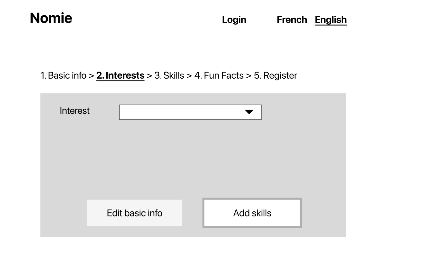
Instead of the one-question-per-screen format, I grouped the questions by categories into a one-category-per-screen format. This solved three problems:
It reduced the number of screens and clicks users had to contend with.
The category names provided the structure for a progress bar so that system status would be visible at all times.
Conceptualizing each section by task-based categories, users weren’t forced to task-switch as often, jumping around between different types of questions and formats.


Streamlining text
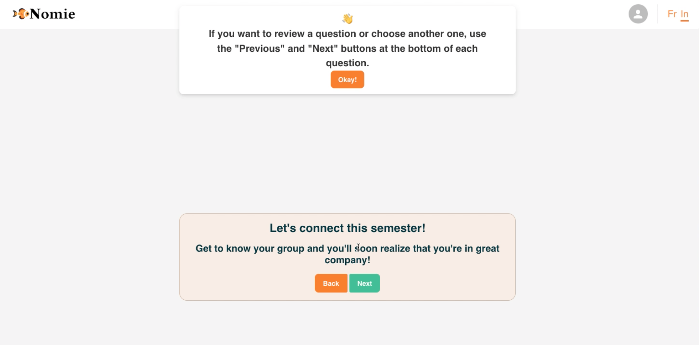
Throughout the flow there were instructional text blocks that felt disruptive and unnecessarily, and increased cognitive load. Because the flow was relatively simple and only utilized buttons and interactions that users should have an existing mental model for, I recommended eliminating explainer text completely.
Utilizing UI components
Selections and text inputs: In order to save space, I swapped in dropdown menus to replace radio buttons. The existing design jumped to a new screen for followup questions based on answers to some questions. For example, users who answered “Music” to the question “What interests you?” were asked to share a favorite artist. I suggested that followup questions appear below the entry instead. This way we could still employ progressive disclosure but with fewer steps.
Buttons: Buttons clearly state the action the user can expect when clicking.
Progress Indicator: A breadcrumb view at the top of the form makes system status visible at all times.
I proposed an onboarding flow that allowed users to register in 6 screens instead of 19 in the original. Below, I’ll explain a few of the design recommendations for this flow.
Empathize > Define > Ideate > Prototype > Test
To prepare for the prototype, we refined Nomie’s branding with a style guide based on existing visual assets, including logos, brand colors, and typefaces.
We conducted two rounds of low fidelity prototype design, implementing client feedback. Once the client signed off on the low fidelity prototype, we built a high fidelity prototype to test with users.
Role: All team members worked on the prototypes. I led the design for the low fidelity prototypes and supported another designer in building the high fidelity prototypes.
Low Fidelity Wireframes v 1
After reviewing our design options, the team decided to base our low fidelity design to present to the client on my category based architecture that combined questions on a single screen. We added a few more tweaks to the wireframe, including:
Moving the privacy policy and user agreement to the start of the flow to both cut down on extra screens and to foster a sense of transparency.
Adding illustration place-holders and providing one AI-generated example to the flow. While illustrations were out of this project’s scope, we felt that illustrations would help to break up the text and add visual interest.
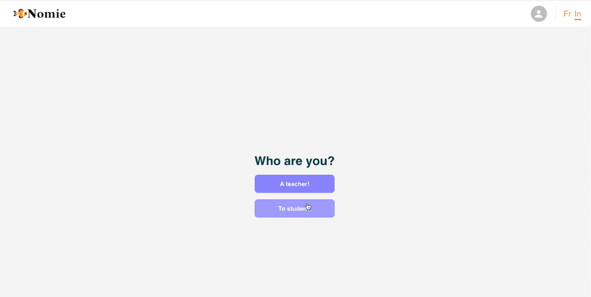
While the client agreed with the changes to text and addition of a progress bar, they decided not to move forward with our recommended 6-screen onboarding design. The client believed strongly in preserving the one-question-per-page design, explaining that multiple questions on a page felt too formal. They had a few smaller asks as well, including:
Polish the UI and text in order to help them visualize the final product.
Add an opt-in box for the user agreement/policy, which we moved from the end of the flow to the beginning intro text.
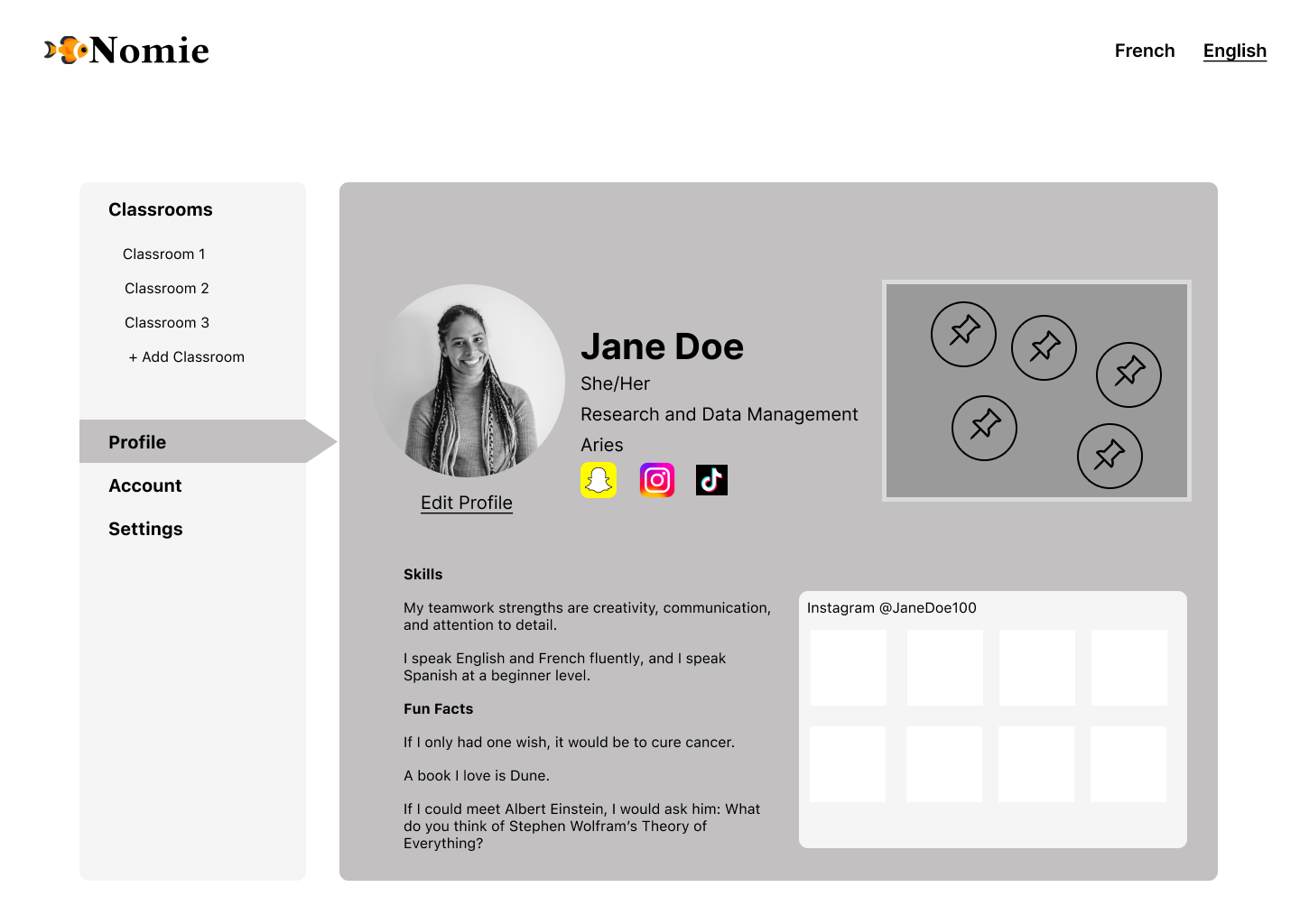
We reworked the profile page and added more UI elements to replace text.


Low Fidelity Wireframes v 2
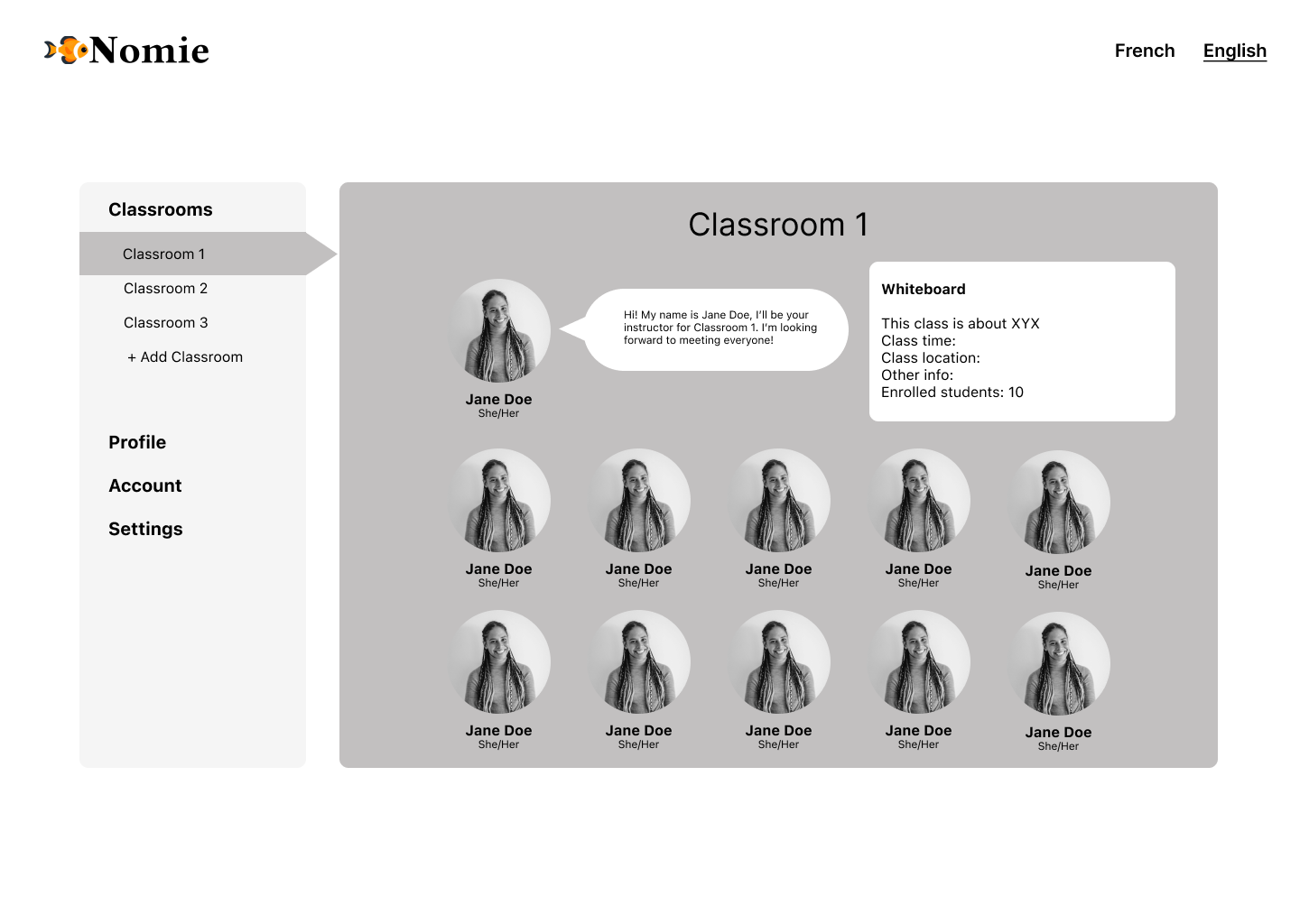
For the wireframe revision, the team worked collaboratively to integrate the client’s need for one question per screen with our category-based architecture. We opted for a tabbed folder-style UI that preserved the categories and visibility of system status while only showing users one question at a time. For multi-part questions, we used progressive disclosure and only showed followup questions once the prerequisite question had been answered.
The client was happy with this overhaul and agreed to move forward with a high fidelity prototype based on these designs.


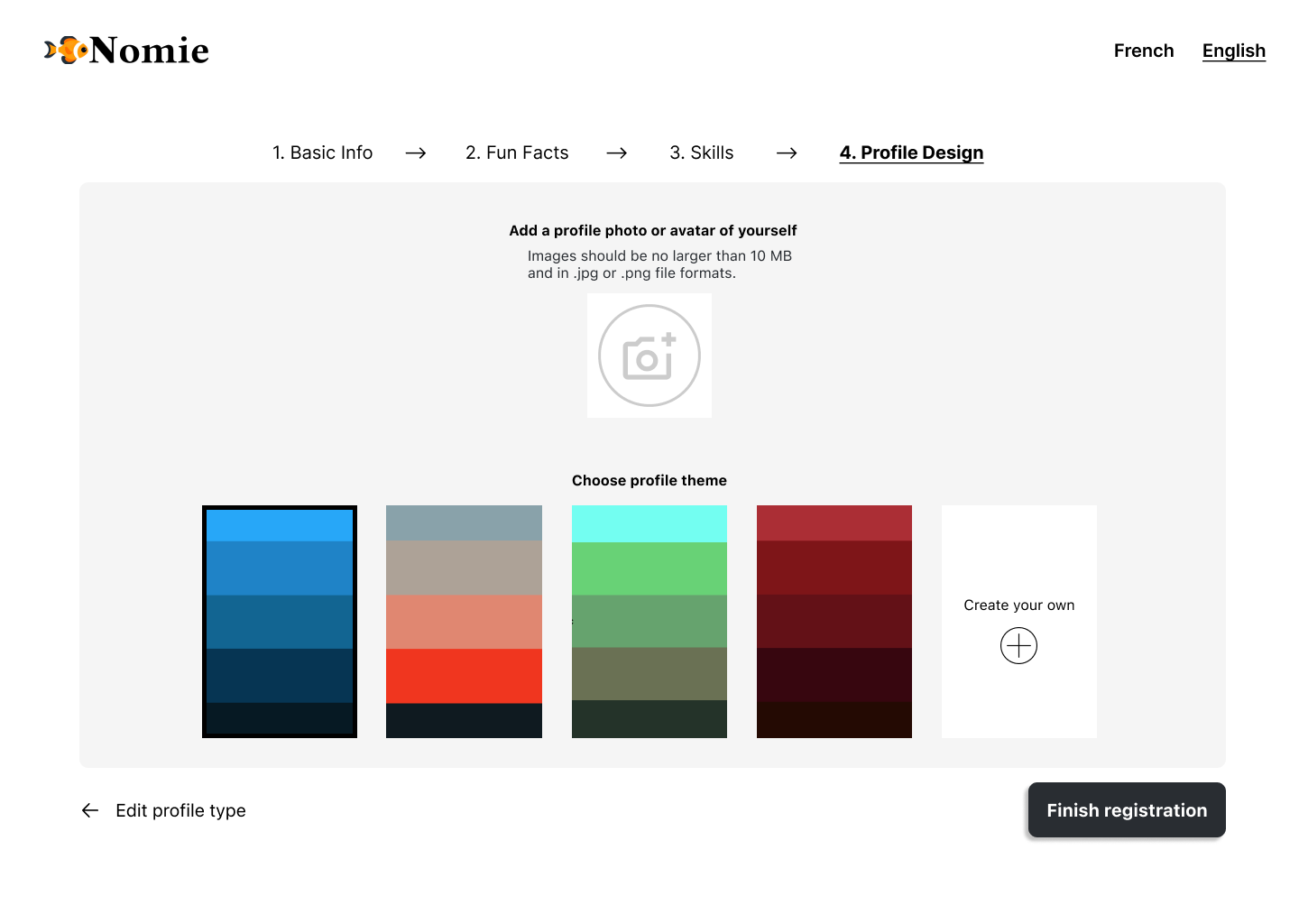
High Fidelity Prototype
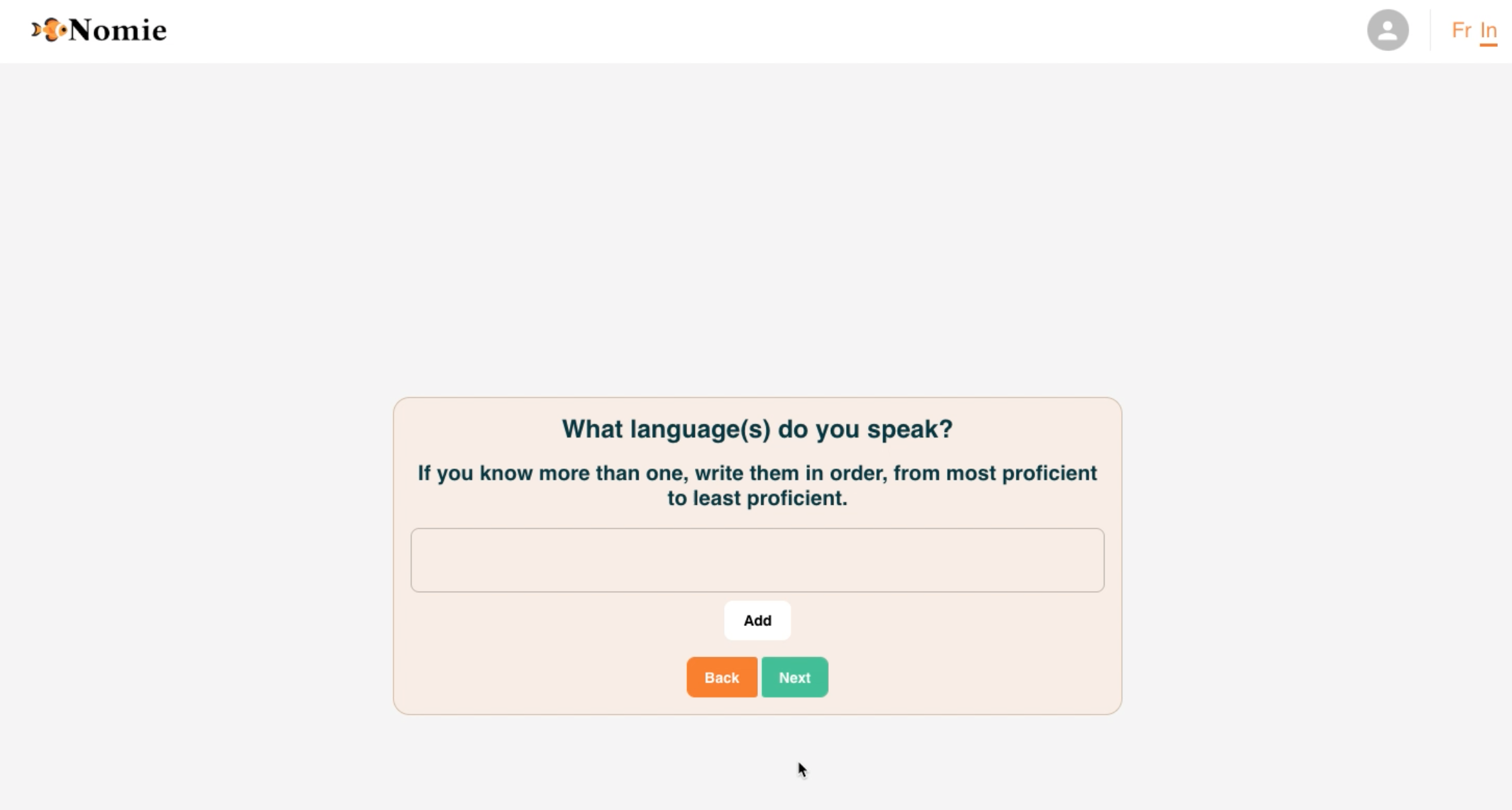
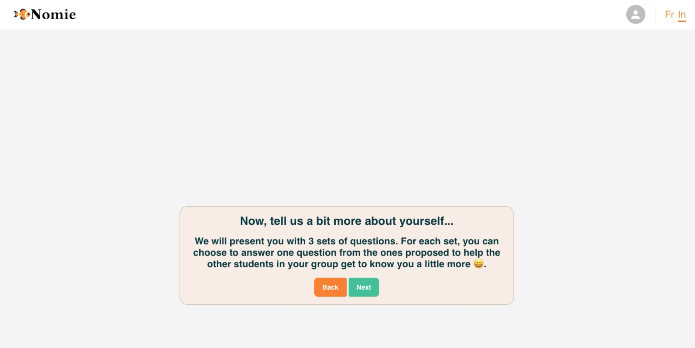
We created the final, high fidelity prototype in Figma to test with users. In the prototype, we refined key elements including the progress bar and the progressive disclosure UI for multipart questions.
Progress Bar
We created a progress bar that provided two layers of system status:
The numbered and labeled sections give the user a high-level understanding of their progress in the flow.
The smaller beads visualize progress at the section level via changes in opacity and saturation.
Progressive Disclosure
Because we increased the progress bar’s complexity, we opted to to simplify the UI in other places including eliminating the tabbed folder-style design.
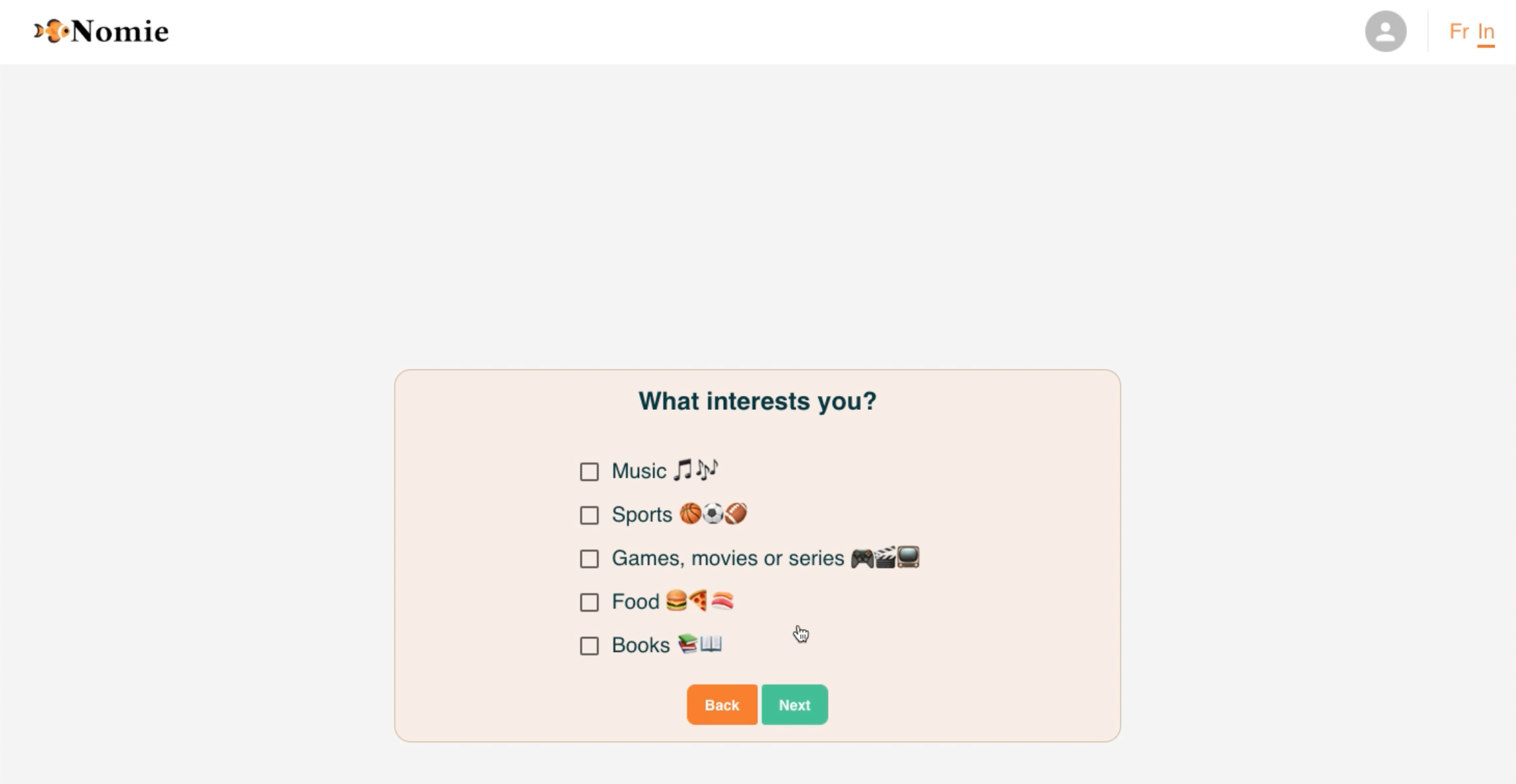
We used color, opacity, and movement signals to guide users to the next step on each screen. Selected answers were outlined in orange and the “next” button only appeared one the first answer was selected and changed color to active green once all of the answers were completed.
We preserved the emojis in the prototype due to the project scope however we recommended to the client that they consider updating them to align better with Nomie branding.


Empathize > Define > Ideate > Prototype > Test
Our testing validated our major design changes, with no critical issues observed in our final round of testing and far fewer major issues. Users were no longer confused while answering questions and felt confident moving through the process. Some users commented that the UI appeared plain and formal, which supported our initial recommendations to the client that future iterations may benefit from higher quality illustrations or graphics.
We compiled our user research findings in a summary table to share with the client, identifying and ranking issues, and describing recommendations for future iterations.
-
To evaluate whether our onboarding redesign solved the critical and major issues we’d identified in initial testing and other secondary research, we tested our Figma prototype with users. After showing the client our high fidelity prototype and getting approval to move forward, we began testing.
Recruiting
Because Nomie could not provide users for testing, we recruited among friends and family who met the criteria of being both current students and between the ages of 18-24.
Testing
The team conducted an initial pilot test to ensure that the test script was clear, and to get an estimate for the amount of time testing would take. After completing the pilot test, we conducted five moderated, 20-minute remote user tests via Google Meet. Users were given one task: to create a Nomie account.
-
User testing found no critical issues and just two major issues (down from the initial 12). Our redesign had eliminated the three major issue categories (unclear wording and symbols, reliance on user memory, and lack of customizability) identified in initial testing.
While we found that we had largely achieved our primary goal for the project, to make onboarding easy and engaging for student users, testing uncovered additional areas for improvement with respect to navigation, visibility of system status, text content and UI.
-
For future iterations of our design, we recommended that Nomie:
Modify back navigation to go to the previous screen instead of the beginning of the category
Change the category names and explore legibility with a card-sort exercise
Invest UI improvements like higher quality graphics
Consider adding a time estimate or completion percentage bar as users progress through the flow
Revise preset options for questions based on user polls
Conclusion
After presenting our user testing findings and high fidelity prototype to the client, we were pleased to hear that they planned to implement many of our recommendations and build a new version of Nomie’s website onboarding based on our prototype design.
If given more time to work on this project, I would have liked to test with more users and get feedback on content preferences to guide decisions on language, answer content for multiple choice questions, and UI. It would also have been interesting to build and test a mobile version of our desktop design.
“Thank you so much for everything, I’m super happy to see your final work and I love it!!!”
– Client response to redesign
Hero image credit to: Zen Chung via Pexels