
Tattoo Website: Redesign Case Study
Objectives: Enhance website UI and optimize the booking process for mobile users of 36thstreettattoo.com
Method: This project used the Design Thinking methodology to update an existing website design.
Role: I designed the website, the booking flow, and wrote all of the copy.
Background
36th Street Tattoo is three-year-old tattoo shop in Seattle that specializes in American Traditional tattooing. I had previously worked with the shop’s owner to build the first version of their website.

Empathize
Client Goals
After three years in business, the client wanted to update the site’s design and address several issues, which we clarified into three project goals.
Update UI: The site UI felt sparse and didn’t match the folky, vintage aesthetic of the physical tattoo shop. In the first design, the client referred to an existing shop’s site as an exemplar and asked that the site design be modeled in that style. In the time since first opening, the client had developed a strong understanding of their brand identity and wanted their digital presence to reflect that.
Prioritize Appointment Booking: Though it was possible to book an appointment through the site, some customers didn’t discover this option and ended up contacting the shop for help booking. The initial goal for the site was to give customers basic information about the shop’s hours and location. Now that the business was more established, the primary goal for the site became driving in-person appointments.
Showcase Tattooers: The number of tattooers had grown from two to six and the site’s nested menu architecture only allowed users to look at tattooers portfolios one at a time via a nested navigation bar. This made it cumbersome for customers to navigate to each tattooer’s portfolio in order to compare portfolios (shown as an embedded Instagram grid). Further, because the tattooers appeared in alphabetical order in the navigation, names higher in the list may have had an unfair advantage.


User Feedback
I reviewed customer messages received via Instagram direct message, text messages, and emails to get a sense of needs that weren’t being met with the existing website. Most of the website-related customer queries were variations on the question, “How can I book an appointment?” This supported the client’s observation that the shop’s booking process needed better visibility.
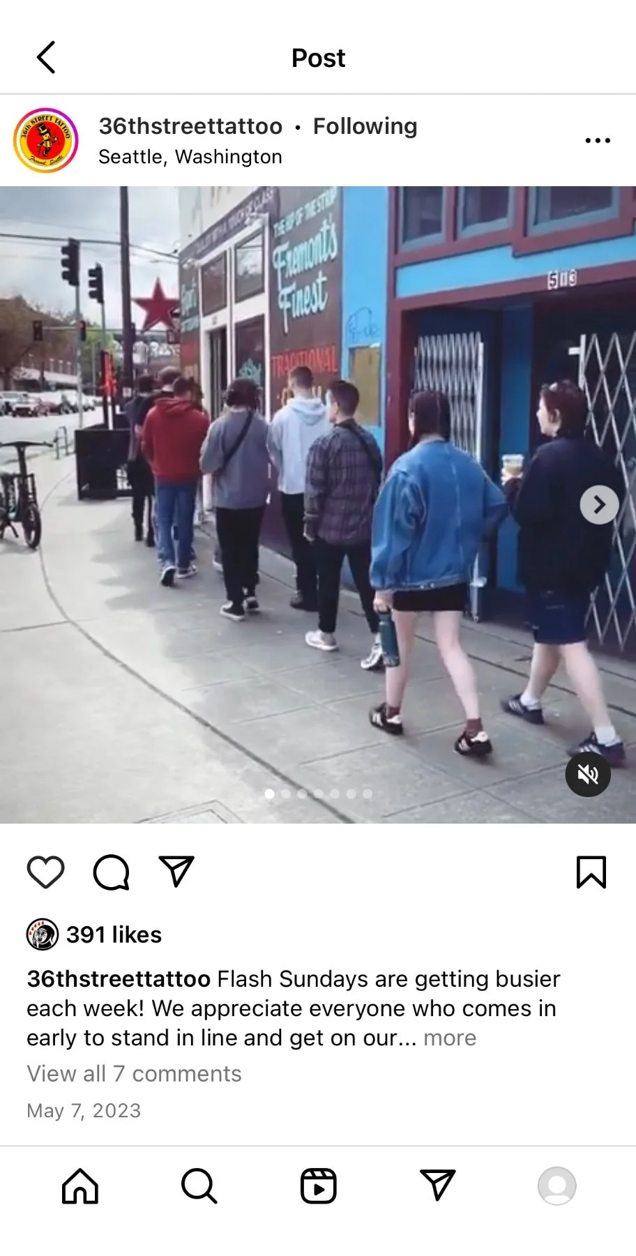
Another frequent query type was messages about “Flash Sunday,” a popular event that the shop had started hosting every week. Customers had heard about the event on social media but wanted more information about how it worked before attending.
Analytics Review
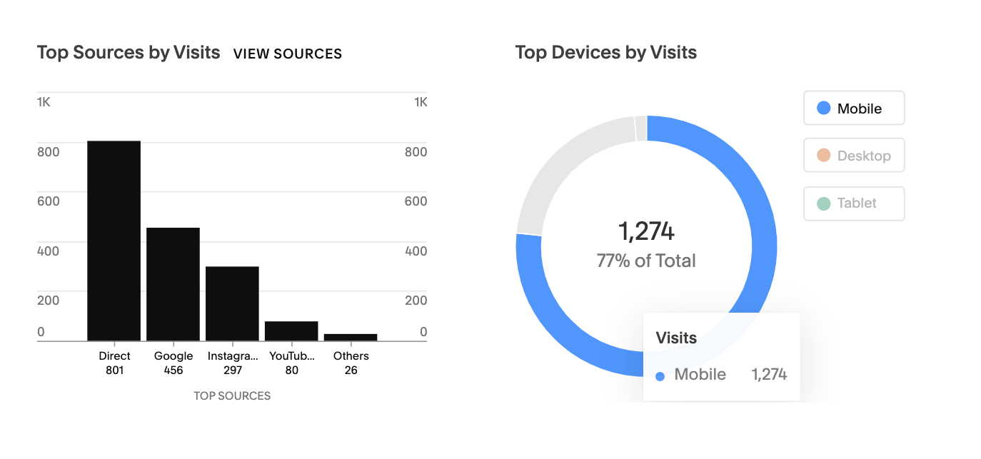
To round out my research, I took a look at the site’s analytics and discovered a few data points that would inform the redesign:
77% of users were visiting via their phones, which meant that the redesign should be optimized for mobile devices. The existing design featured too much small text and didn’t have the most important information (how to book) above the fold.
The majority of visits were direct traffic — customers were likely typing the site url in directly or had bookmarked it; another sizable chunk of visits came from Instagram. This tracked with the owner’s estimation that about half of the clients were return customers. The owner wanted to keep the site’s text to a minimum and felt that it should be targeted at experienced users, i.e. people who were familiar with the shop and the tattoo process. The primary user’s familiarity with tattooing and 36th Street was important to consider when making decisions about content and tone.
The homepage’s bounce rate was ~47%. This is a little higher than what’s considered healthy and might indicate that the page design isn’t meeting user expectations. A reduction in that rate would prove a valuable KPI to track post-redesign.
Original Website
Define
With all of this in mind, I reframed the project goals and research findings into How Might We questions:
HMW drive online booking, optimizing for mobile users?
HMW align the shop’s digital and physical aesthetics?
HMW make it easier for customers to choose among the shop’s tattooers?

Ideate
Site Map
Because customers were having trouble finding information (how to book an appointment, what to expect during a weekly event, who the shop’s tattooers were) I knew I’d need to rework the structure of the site.
On the original site, booking information was located on each individual artist’s booking page but there was no clear booking CTA on the website’s homepage or navigation. Additionally, because there was no landing page from which to view all of the tattooers at once, users had to use the top navigation to view tattooers one at a time.
In the new sitemap, I created a landing page featuring all of the tattooers with tattoo thumbnails for each person. This also gave me a single page to link the “Book” CTAs to.
Original Sitemap
New Sitemap
UI Sketches
I mocked up a few screens to experiment with UI ideas and get feedback from the client.
In order to make the UI more lively, I pulled in some of the colors used on the shop’s external hand-painted signage.
I took photos of the interior walls to use as possible backgrounds for different pages on the site, thinking that this might give the digital version of the shop a closer connection to the physical space. This included using a photo of the felt letterboard in the shop as the homepage photo.
While the client liked the new color palette, he felt that the background photos were too distracting and decided to go with something simpler.


Prototype
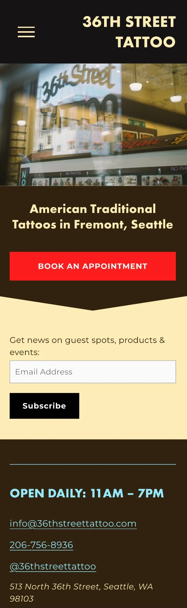
Homepage
I wanted to build a homepage that was legible to both new and existing customers. For new customers, I added some short descriptive text describing the shop’s tattoo style and location. arrived on the site would know exactly what the shop was about right away. For existing customers whose goal would be to book an appointment, I made sure to add a "book an appointment” button prominently, above the fold.
To cut down on text, I opted for a different photo of the shop that didn’t feature as much lettering but still gave a users a sense of the physical space.
Tattooers Page
I went with circles instead to soften the harsh grid structure that would be imposed by square containers. I made the image and text clickable, linking to each tattooer’s booking page and decided not to make buttons for each page because having multiple buttons of the same visual weight so close together felt overwhelming.
Navigation Menu
I added a “BOOK” CTA in the menu because I also wanted to make sure that the owner’s primary goal for the site, to promote the site’s booking capabilities, was emphasized from many different points on the site.


Booking Task Flow
Prior to the website redesign, I worked with the shop to design a low-touch appointment booking process. I carried this process over to the new website with no changes, though because of the higher visibility booking CTAs it was more accessible to users.
Problem: The shop didn’t have a full-time front desk assistant to field the emails, texts, and calls of customers looking to make tattoo appointments. I had to make it easy for customers to book appointments themselves via the website, however tattooers felt it was important not to let clients book appointments with zero supervision. Tattooers had to be looped into the process so they could use their expertise to assess the amount of time needed for the appointment, and determine whether a pre-appointment consultation was necessary.
Tattooer Interviews
I spoke with several of the shop’s tattooers to understand their end-to-end process for booking clients. Most of the tattooers exclusively used iPads or cell phones instead of desktops or laptops and didn’t want to do a lot of typing. All of the tattooers wanted a process that required a minimal amount of communication overhead (e.g. emailing and texting back-and-forth with clients to set up appointments) but still allowed them to get enough information about the client’s tattoo to be prepared for the appointment and book them the appropriate amount of time or amount of appointments.
Solution: I designed a process to streamline customer booking while enabling tattooers to review tattoo information via an intake form and select the template with the appropriate booking time.
Inquiry forms linked on each tattooer’s booking page enabled customers to provide information about the tattoo they wanted with details like design description, size, and placement.
Those inquiry forms went to tattooers’ emails where they could review the information and either follow up with the customer to get additional information or send a template response with a link for the customer to self-book an appointment or consultation.
Email response templates included instructions for booking along with links to Squarespace’s Acuity scheduling software where customers selected a date and time, and sent a deposit.
Step 1: Customer submits appointment inquiry form
Step 2: Tattooer sends template email with booking link
Step 3: Customer uses link to book appointment
Test
To evaluate the redesign, I conducted informal testing sessions with five users. I asked them to visit the website and book an appointment. I also asked users to give general feedback on the look and feel of the site.
All users quickly identified the new “Book” button and were able to complete the intake form with little trouble.
Future Issues
Input redundancy: In the current flow, clients are forced to submit duplicate information. They submit their appointment details and contact info once for the intake and a second time when booking the appointment. Ideally, the client would only have to submit that information once, however, there isn’t currently a way for the client to autofill that information the second time. An experienced web developer may be able to create a custom workaround for this in the future but it’s not a high priority at this stage.
Aftercare page is text-heavy: Some users commented that the aftercare page featured a lot of text without any images. Another user requested that more products be suggested so that customers can buy products in advance of their appointment. Product images with links would both break up the text and provide an opportunity to add a revenue stream for the shop through affiliate links.
Bounce rate: In the three weeks since the design update went live, the bounce rate decreased 10% to 43%.
Hero image credit to 36th Street Tattoo and Connor Surdi.