
Diabetes Management App: Design Case Study
Objective: Improve app-based management for Type 1 Diabetes.
Method: This project used the Design Thinking methodology to build a prototype of four red routes.
Role: I conducted the research, design, and writing for this project.
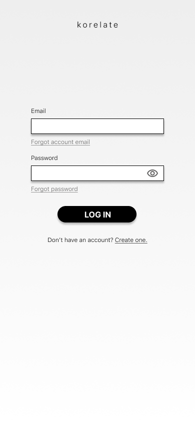
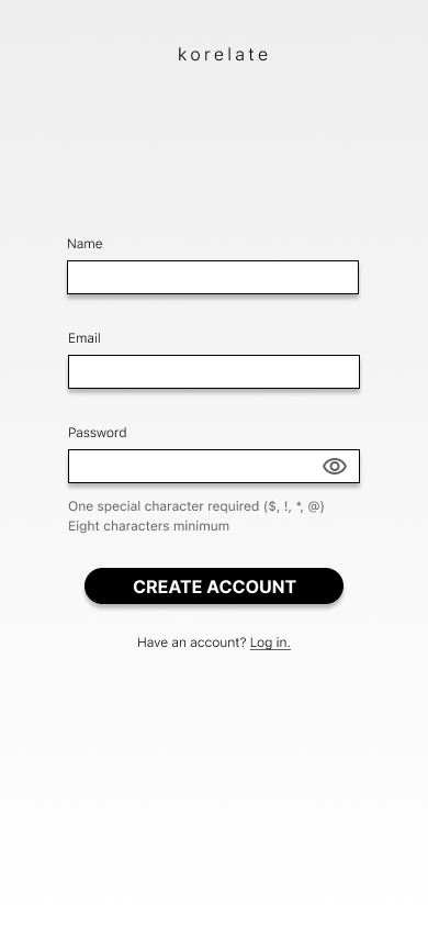
Deliverable: Korelate App Prototype in Marvel
Background
Type 1 Diabetes is an incurable autoimmune disease in which the body can’t produce insulin, a life-sustaining hormone that regulates blood sugar (also called blood glucose).
The disease affects 9 million people globally — 1.6 million of them live in the US.
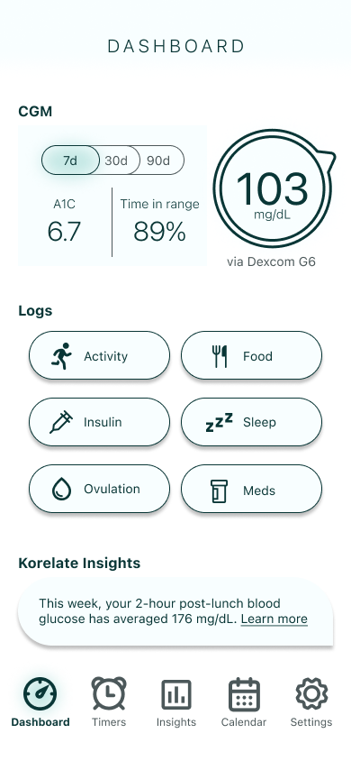
About half of people with T1D wear a medical device called a continuous glucose monitor (CGM) to manage their condition. CGMs are shown to improve health outcomes because 24/7 blood sugar monitoring provides behavior feedback and identifies trends, enabling more informed care decisions.
CGM data can also be used in conjunction with other biometric and health data (via sleep trackers, activity monitors, food diaries) to gain insight into the impacts of other factors that affect blood sugar.


Empathize > Define > Ideate > Prototype > Test
Through secondary research and primary research (user interviews), I set out to understand the existing diabetes app landscape and identify the goals, motivations, and pain points for the nearly 1 million people with T1D who manage their health with CGMs (typically via mobile app) and diabetes-related apps.
I discovered that existing diabetes apps are falling short of their potential to help users because of issues like poor CGM and health app interoperability and burdensome UI.
Secondary Research Findings
While diabetes app use is correlated with improved health outcomes, adoption remains low. Only an estimated 1.2% of diabetics use apps as part of their management regimen. This is not for lack of options: there are over 1,000 diabetes apps and over 350,000 health apps with potential integrations for diabetes-relevant data. One study found that T1D patients using CGMs still expect help interpreting CGM data and rank “simple and predictable diabetes management” as their top priority among unmet needs.
My secondary research identified four main management challenges for people with T1D:
It’s complicated. An estimated 42 factors affect blood glucose. Mental and emotional exhaustion is the leading cause of T1D burnout, which can be life-threatening.
It’s difficult to manage. 66% fail to meet blood glucose targets. 50% will develop a serious complication in their lifetime.
It’s expensive. Americans spend $16 billion on T1D-related healthcare annually. Individuals spend an average of $2,500 out-of-pocket every year.
It’s time-consuming. Patients spend an average of 4-5 hours a day on diabetes-related care.
This suggests there’s an unmet need among T1D patients for a more user-friendly diabetes management app that presents actionable insights gleaned from integrated CGM and health data.
Primary Research Findings
After talking to five people managing T1D with a CGM, I found that users are often data rich and insight poor. I synthesized my research findings with an Affinity Map, a Rainbow Spreadsheet, and User Personas.
While most participants reported using multiple apps to track diabetes-related data like exercise and diet in addition to using a CGM to track blood glucose trends, they felt that app integrations were limited. Many participants reported using CGM data to identify trends, though none credited the app with identifying the insight—rather trends were often identified by a healthcare provider analysis or anecdotal self-reflection.
Carb counting is hard, even for experienced and engaged users.
App integration is limited between health apps and CGMs.
Data UI isn’t always user-friendly, making insights difficult to understand.
Alarms could be more customizable and are sometimes disruptive.
Comorbidities complicate management and require extra support.
-
I interviewed five eligible participants for 45 minutes each to understand behavior, needs, and pain points relating to CGM and health app use in T1D management.
-
In order to assess challenges particular to T1D patients who might benefit most from a diabetes management app, I focused on recruiting people who had some experience managing their condition with a CGM and other health apps.
Diagnosed with Type 1 Diabetes for a minimum of one year
Currently using a CGM via mobile app
Currently using at least one other health app related to diabetes at least once a day
Is a US resident aged 18 or older
-
I used a 10-question screener survey to identify potential participants, assess eligibility, and collect demographic information.
Because of the relatively niche user group, I recruited aggressively using paid methods via survey with an incentive of $30 upon completion to T1D Facebook groups, Reddit, and userinterviews.com.
-
What tech (apps and devices) are users using and what do they like and dislike about them?
What are the top pain points for users trying to understand their CGM data?
Which health apps are users most interested in integrating with their CGM data?
What are users’ questions about the relationship between CGM and health app data?
What are users’ levels of tech, diabetes, and health literacy?
User Quotes

Empathize > Define > Ideate > Prototype > Test
Once I had a better understanding of T1D patients’ goals and challenges, I brought them into sharper focus with user personas and problem statements.
The user personas are based on screener survey data, secondary research, and primary user interview material. It was important to build several personas to foster a robust understanding of the wide array of needs and challenges that users have when it comes to digital management of T1D. The primary characteristics I focused on were length of illness, informational needs, lifestyle factors, and motivations because these are strong drivers of individual behavior.
I distilled my research down into a several problem statements, turned them into HMW statements, then streamlined them into a single statement to clarify the problem my app would solve for users.
User Personas


How Might We…
Make CGM and health app data easier to understand holistically?
Improve the process of carb counting and exercise tracking?
Make data easier to view and access on a phone screen?
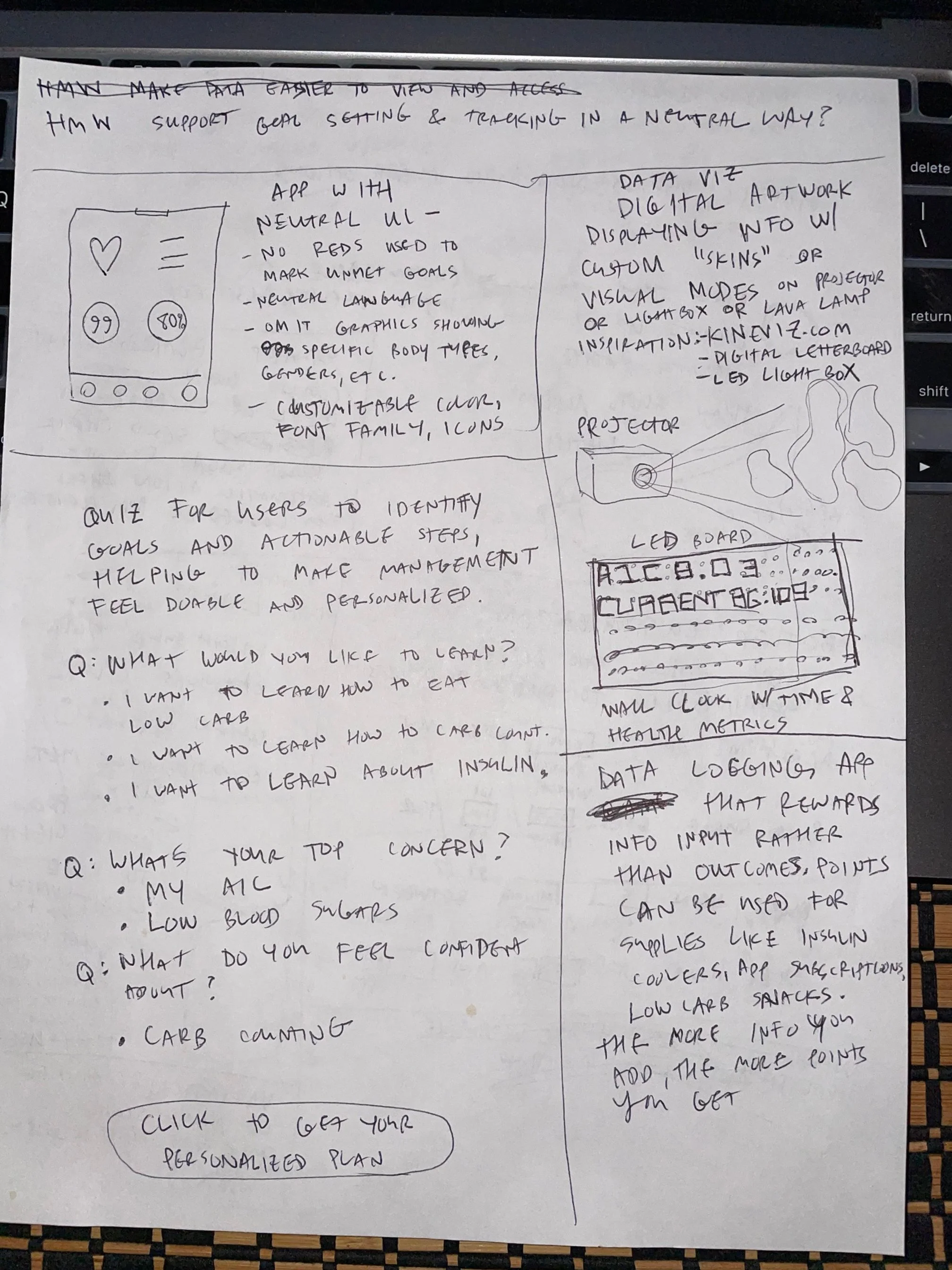
Support goal-setting and tracking in a neutral way?
Make alarms useful but not disruptive?
Assist management of coexisting mental and physical health issues?
How might we simplify diabetes-related data
to support decision-making for T1D patients?
Empathize > Define > Ideate > Prototype > Test
To stimulate creative thinking and get excited about possible solutions, I ran a 30-minute brainstorming session and sketched out as many ideas as possible. After getting some ideas down on paper, I fleshed them out a little in a doc, making a few notes on each idea and then selected three of the top ideas. From there, I picked the solution I’d focus on: a smart data hub that generated usable insights by integrating diabetes-related health apps.
Brainstorm Sketches


Empathize > Define > Ideate > Prototype > Test
Before building the first of three prototypes for my insight-generating T1D data hub, I spent some time thinking through the functions I’d need to build an MVP and how they might look. I created user flows, a story map, a loose visual design plan, and wireframe sketches.
User Flows
When choosing the user flows to include in the MVP, I thought about the parts of the app that would be essential for the user to start using the app in a meaningful way. Aside from the basic account setup, this meant two main things:
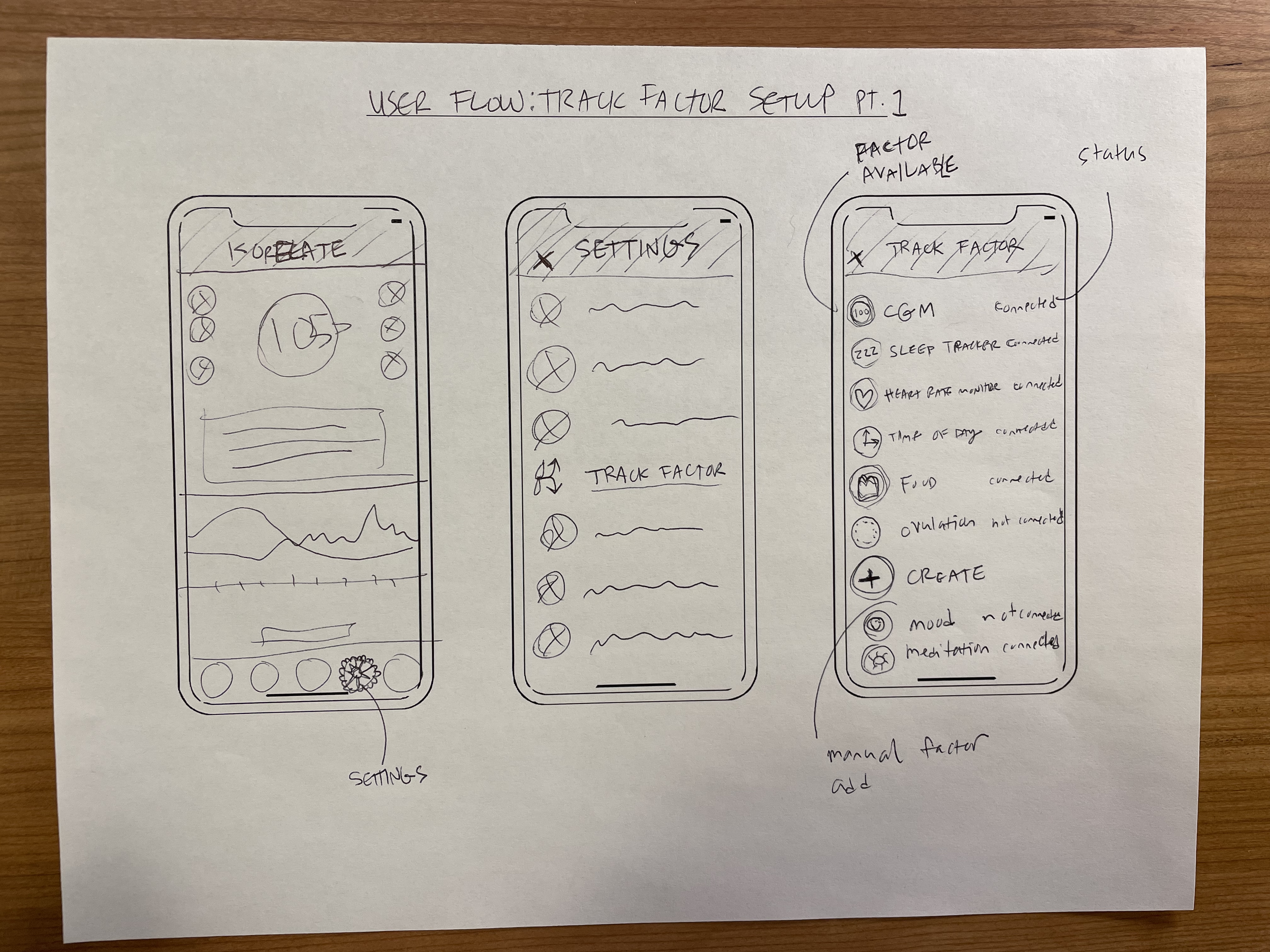
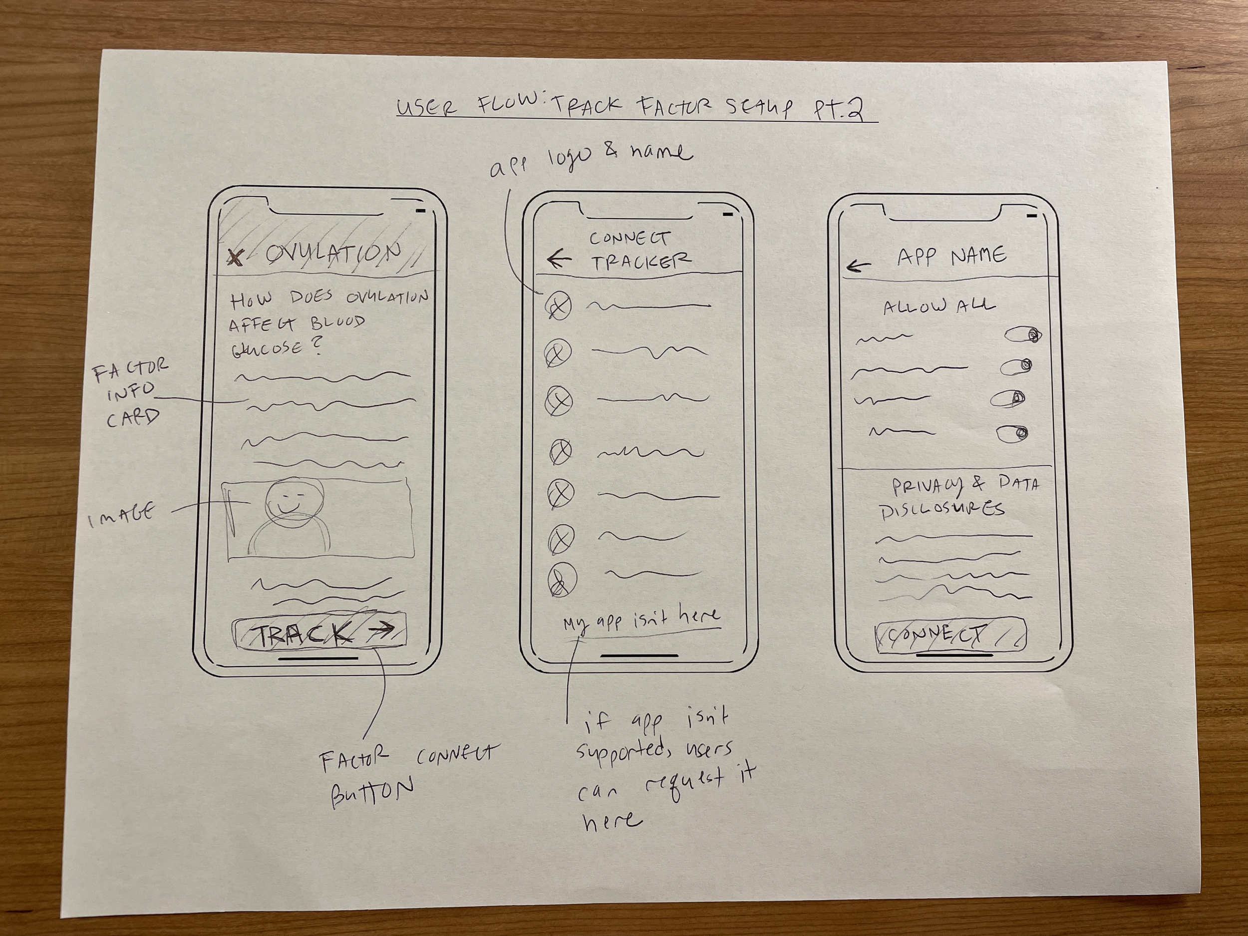
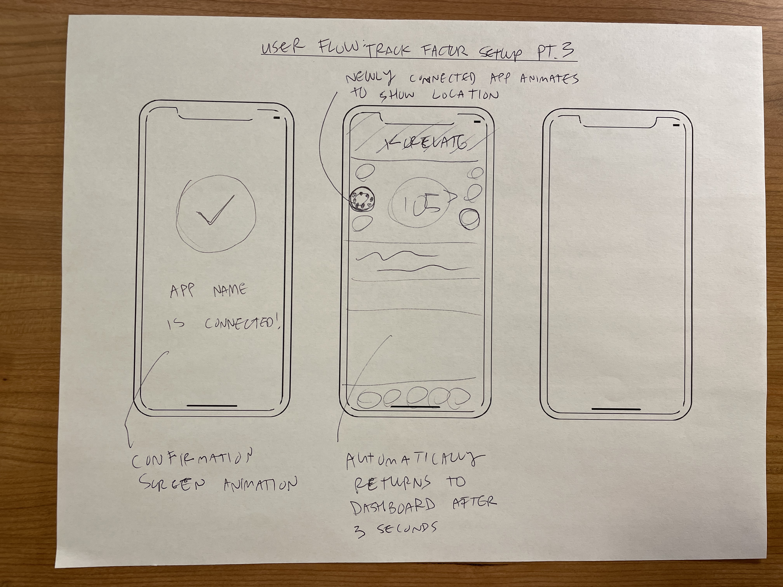
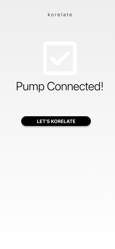
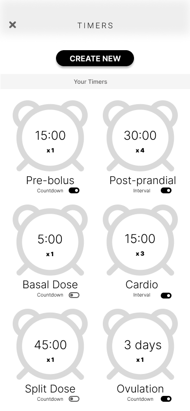
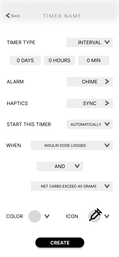
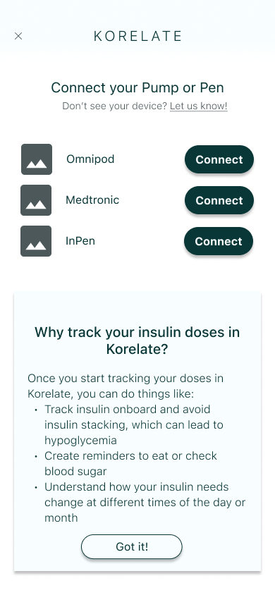
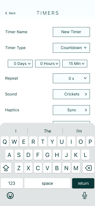
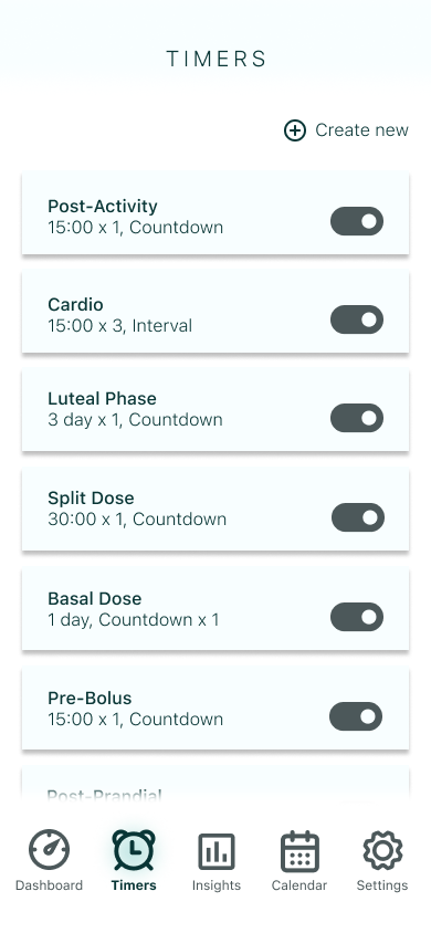
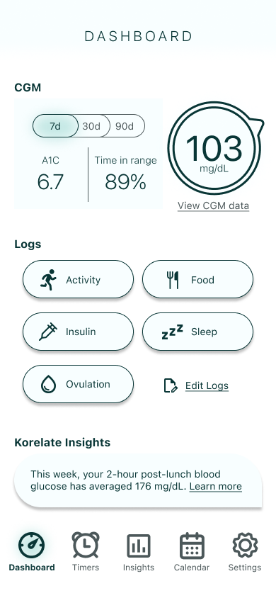
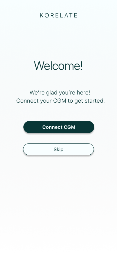
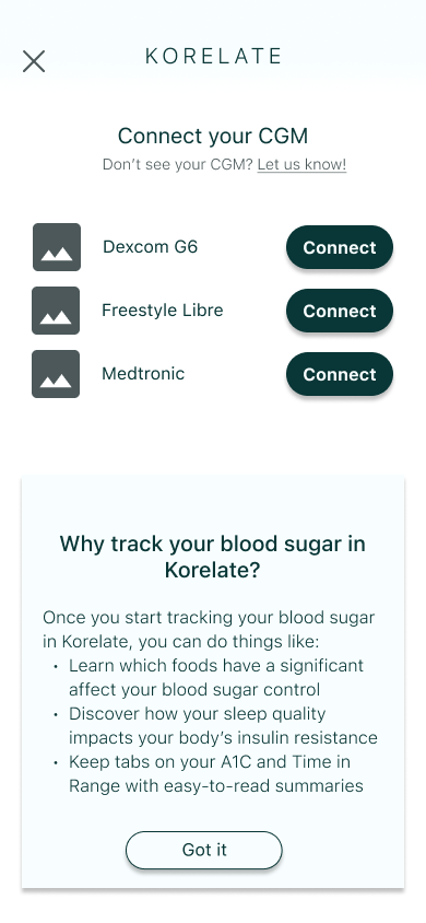
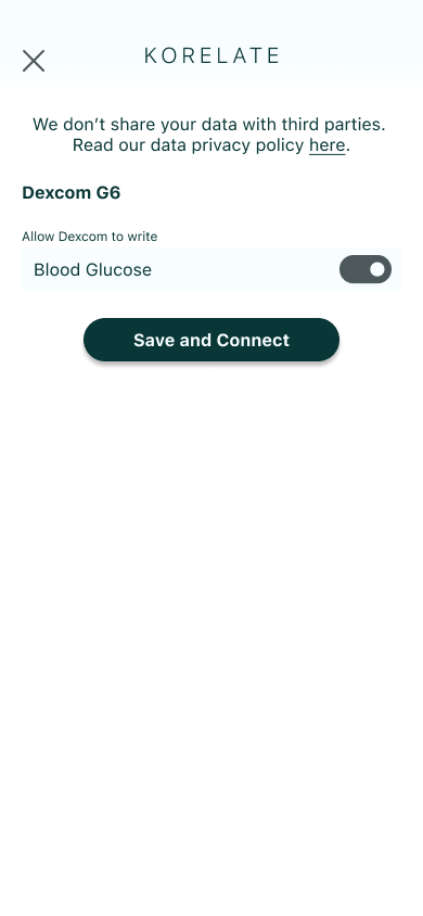
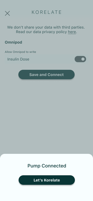
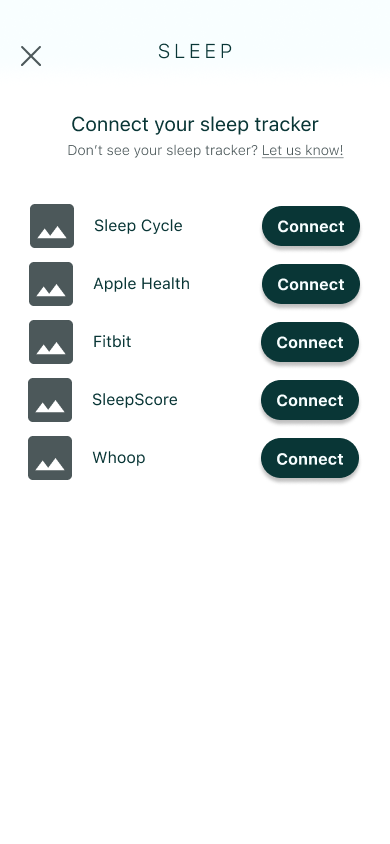
1. Enabling integration of external apps (including CGM app) that would feed the app data to build insights. I decided to combine connecting the CGM with the onboarding/login flow because that integration is the basis for all of the metrics that the app’s insights are centered on. Because many users I spoke to had trouble with timing and alarms, and because timing is an essential component in blood glucose control, I also wanted to build a timer flow as part of MVP.
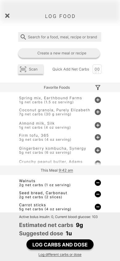
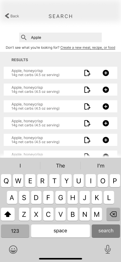
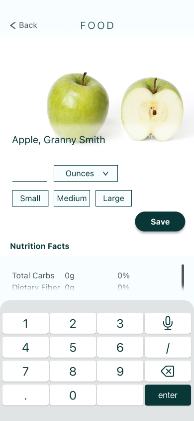
2. Building a flow to log food and insulin in a seamless way. I wanted to make sure the user could complete all essential logging tasks (logging food, for example) in the app rather than opening several different apps before being able to use this app. In other words, passive data streams would be pulled into the app via app integrations and active data streams would take place in the app.
Story Map
Visual Design
To get an idea of how the app UI would look, I researched the visual language used in digital wellness spaces and drew upon comments from my user interviews. I visualized these ideas with a mood board and color palette.
Brand Personality: A personal diabetes assistant in your pocket, helping you manage blood sugar with intelligence and efficiency.
Brand Attributes: Transparent, helpful, accessible, smart, safe, calm.
UI Inspiration: Robust data hub that feels approachable, not cluttered.
Color Palette: Subtle tints, refined colors; minimal use of stark white, true black and primary colors.
Low Fidelity Sketches


Wireframes
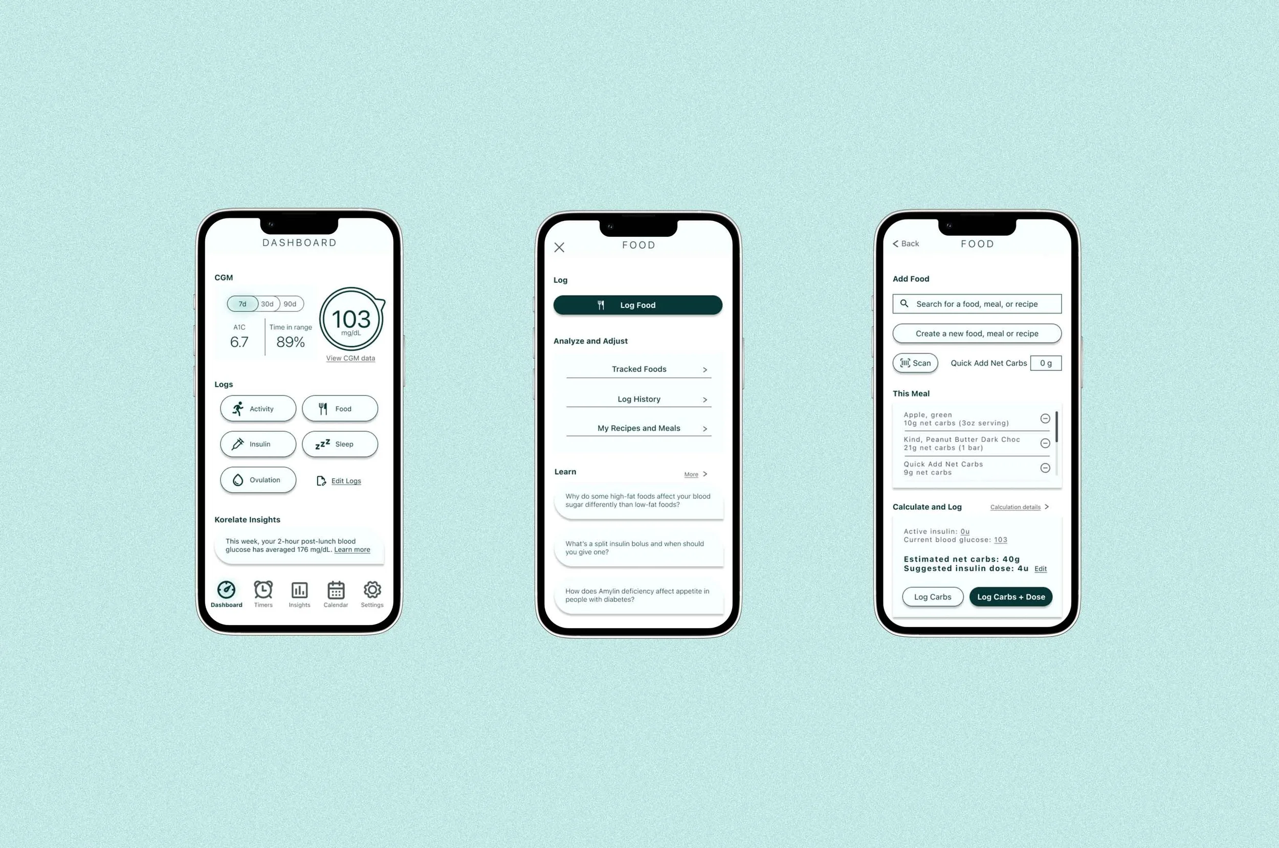
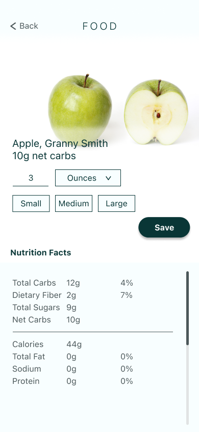
Food Logging Wireframe


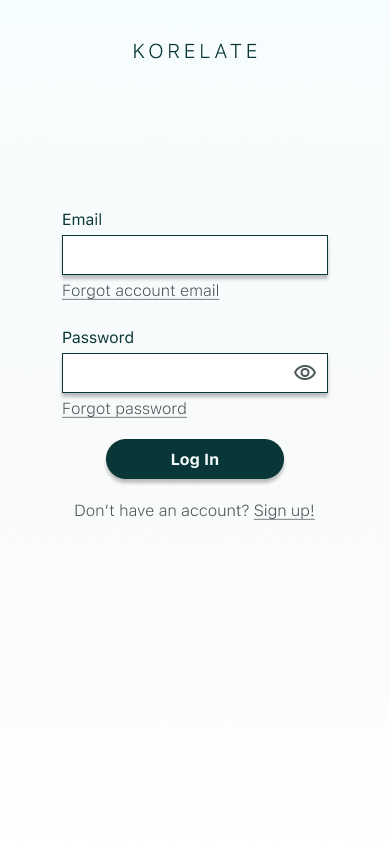
Sign Up Wireframe


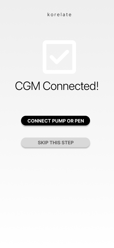

Timer and Connect App Wireframes


Empathize > Define > Ideate > Prototype > Test
Wireframe Guerrilla Test
In order to catch any general usability issues prior to testing with the target audience, I tested my low fidelity prototype with five people. Because the UI was built for users with a specific illness, I made my wireframes higher fidelity than might be necessary for other apps to ensure that users were able to navigate well enough to give me useful insights.
In testing, I found that the UI would benefit from reduced use of icons and that the food logging flow could be refined and simplified.
-
I conducted five interviews remotely over Google Meet with five users who were friends and family. I asked them to share their screen and narrate their thoughts and actions as I watched them move through the app and complete three red route tasks in the Marvel prototype.
Task 1: Create a new timer
Task 2: Connect an ovulation tracking app named Natural Cycles to the dashboard
Task 3: Log a meal
With the test, I wanted to do two things:
Gauge whether the icons and text make the features need to complete each task easy to identify
Identify any pain points or areas of confusion during the tasks
-
Because the app is designed for a very specific demographic to use, I focused on creating a higher fidelity prototype for the guerilla test. I wanted to minimize the noise to signal ratio that might be present with the more niche UI and might not translate well in a low fidelity prototype. I wanted to make sure that when I tested with the target user group (type 1 diabetics), the app has a decent level of usability/discoverability for general users who wouldn’t be familiar with the specific capabilities.
-
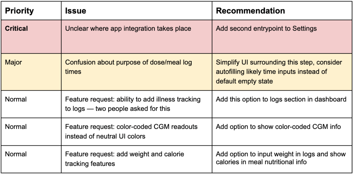
I learned a few things about the design that were unexpected and I was able to identify a few areas for improvement. Some of the issues were due to the low-fidelity and limited functionality of the prototype. I ranked the design issues by levels of severity: Normal=nice-to-haves, Minor=causes frustration/friction while completing task, Critical=stops user from completing task.
In general, users were able to identify and access the buttons needed to enter into each task flow. Because there are about a dozen icons on the dashboard, I expected people to take a longer time to navigate and scan the available options. This indicates my icon choices were successful and/or the placement and page design was simple enough to support so many icons.
The main pain points and areas of confusion were also due to the limitations of the prototype. For example, one of the tasks required typing on a keyboard and I had to walk users through that step since the keyboard didn’t have full functionality. Other examples were fields that couldn’t actually be changed, dropdown menus and buttons that couldn’t be toggled, and pages that couldn’t scroll. These are expected and unimportant pain points that aren’t relevant to prototype improvements at this stage.
-
The recommendations based on my findings are:
Expand the tappable area for certain features to allow for users who don’t immediately register icons, where possible.
Add confirmation popups for areas of the user flow that end in submitting a form of some kind, e.g. a food log entry, an alarm creation, or an app/device connection.
Simplify the food dashboard and simplify the food icons to avoid confusion.
Modify the timer layout to make it clear what the preloaded timers are.
Empathize > Define > Ideate > Prototype > Test
Prototype 1 Design
Food Logging Flow


Sign Up Flow


Timer Flow


Connect App Flow


Empathize > Define > Ideate > Prototype > Test
Prototype 1 Test
-
I conducted five moderated, 30-minute usability tests via Google Meet. Participants were asked to complete four red route tasks using the prototype in Marvel, while sharing their screen for observation. I recruited via userinterviews.com and screened for participants who had a diagnosis of Type 1 diabetes and used a CGM. My research goals for the session were to assess general impressions of the UI and its legibility, and identify any pain points in the red route user flows.
-
All of the main issues identified in user testing sessions were related to the food logging flow. This was not surprising, given that it is both the most complicated flow in the prototype and that bolusing correctly for meals is generally known to be a significant challenge for diabetics.
-
The recommendations based on my findings are:
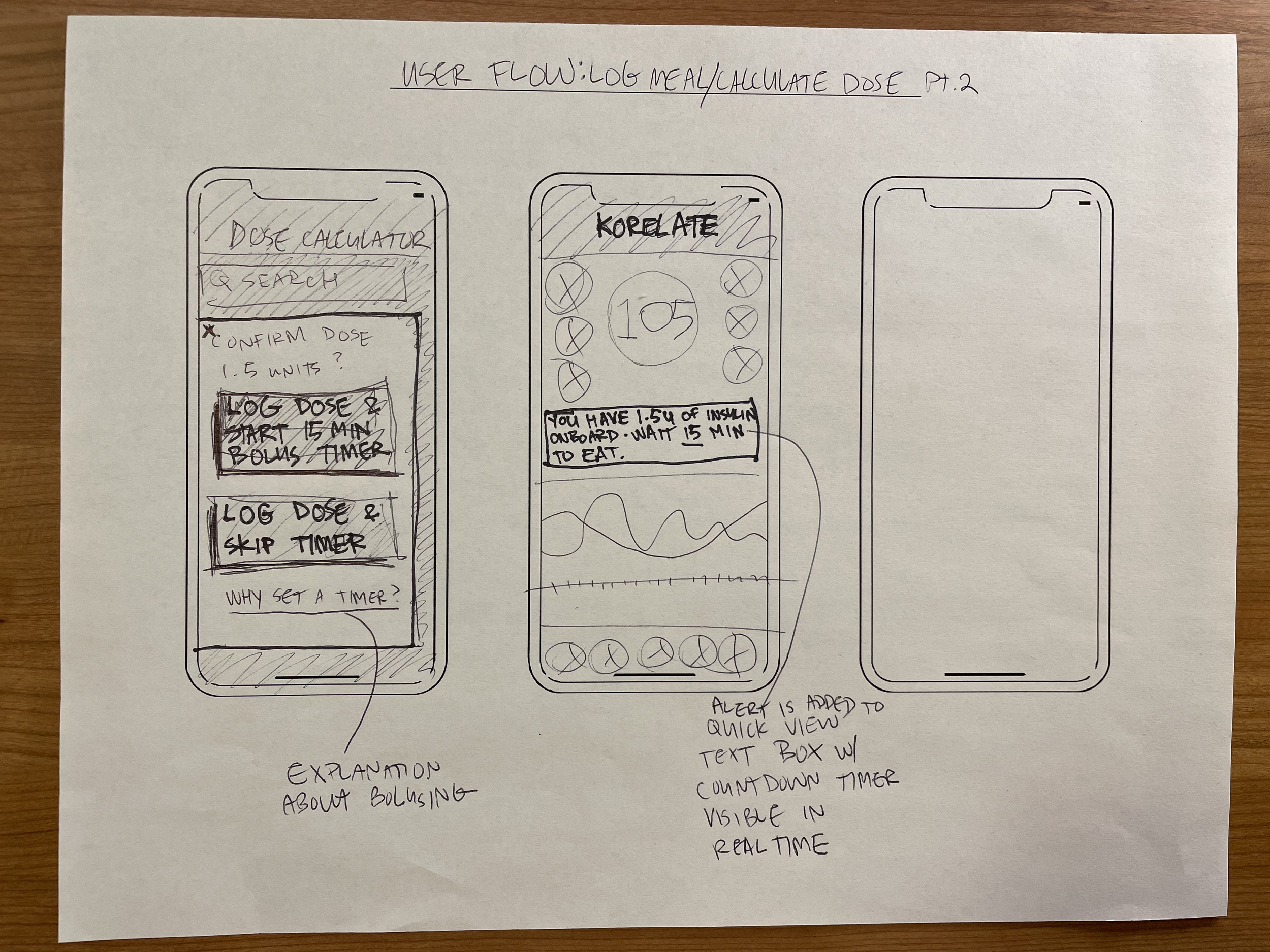
To fix this issue, I will add a popup screen for users to set meal time and dose time
Modify buttons and message text, add option to adjust buttons in settings
Add option to manually adjust dose or carbs
Create a separate section for food logging and make button more visible to direct user focus
Rename menu items to make function more clear
Food Logging Flow


Sign Up Flow


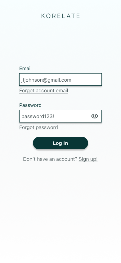


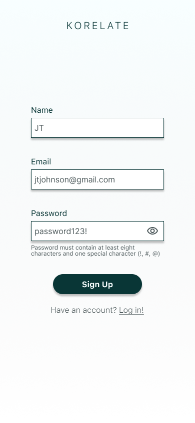


Timer Flow


Connect App Flow


Empathize > Define > Ideate > Prototype > Test
Prototype 2 Test
-
I conducted five moderated, 30-minute usability tests via Google Meet. Participants were asked to complete four red route tasks using the second iteration of the Korelate prototype in Marvel, while sharing their screen for observation. I recruited via userinterviews.com and screened for participants who had a diagnosis of Type 1 diabetes and used a CGM.
My research goals for the session were twofold: 1. To assess general impressions of the UI and its legibility, and identify any pain points in the red route user flows. 2. Assess whether the solutions I attempted to solve were successful in mitigating the pain points identified in Session 1.
-
Modification to the UI appeared to solve two of the three issues identified in the first round of testing sessions. Users were able to quickly identify where to log a meal from the food dashboard and they were also able to quickly guesstimate portion sizes without the use of a scale with added buttons for size estimates.
Users continued to have trouble with the part of the food logging flow where they need to enter times for dose and meal. The first iteration didn’t separate these time but when given the option to separate these times, some users found it confusing and cumbersome.
A new issue arose in the second round of testing: some users guessed that they should go to Settings to add an app to their logs, instead of tapping on the relevant log icon itself.
-
A third iteration on this feature would focus on simplifying the text, decisions, and number of steps in this part of the meal logging flow.
Possible UI solutions could be a redesign of the logging screen to incorporate the time and dose logging inputs rather than including them in a popup.
Another solution could be to put this part of the flow on an entirely new screen to give the text and buttons more room and make it easier for users to process.
Instead of the default state being empty for these inputs, defaulting the times to likely or frequently used inputs could also cut down on decision overhead.
Persona images credit to: Pexels