
Art-viewing Mobile App: Design Sprint Case Study
Objective: Build a mobile app to improve the art-viewing experience for museum visitors.
Method: This project used the 5-day Google Ventures design sprint methodology (modified for a team of one) to build a prototype for a single user flow.
Deliverable: GalleryPal App Prototype in Figma
Research
To identify user challenges and goals, I consulted user persona quotes and an expert interview from a museum tour guide provided by Springboard. Based on insights from these materials, I wrote a HMW question to frame the user’s primary challenge and guide the solution ideation process.
Next, I conducted lightning demos to get a sense of existing app landscape, analyzing five art-viewing apps: Artsy, The Met, Saachi, San Diego Museum of Art, and Instagram.
Once I had an understanding of existing solutions, I created an end-to-end map to visualize where my design solution would fit into the user’s museum journey.
-
According to the expert, visitors don’t typically come to galleries with deep background knowledge and need context about the artworks and artists in order for their visit to resonate. The expert also stressed the importance of encouraging people to feel agency in their experience of artwork rather than relying only on information given to them.
The persona quotes validated the expert’s insights: Visitors wanted agency over their museum experiences and to access information at their own pace. While some people wanted deeper dives into artist backgrounds and processes, others felt overwhelmed by too much information.
-
Problem: Visitors want to learn more about art but it can feel overwhelming.
How might we empower museum visitors with information about art that educates but doesn’t overwhelm?
-
Many apps included discovery elements, encouraging users to explore content beyond their initial search target.
All apps had artwork information cards that shared nearly universal characteristics: artwork image, artwork title, artist name and birthdate, and a description of the artwork and materials. Descriptions were sometimes presented in large, uninterrupted blocks of text.
Some apps went a step further to offer “map” buttons to help users located artworks in the physical museum space.
Many apps supported familiar social app interactions like favoriting, following, and sharing. on
-
Visitor arrives at museum → Sees artwork they want to know more about → Opens app → Goes to search tab → Searches artwork → Sees information card for artwork → Knows more about art
-
![]()
“I don’t really enjoy group tours because I like to do my own thing… but sometimes I listen in to learn a few facts about the artist or the piece itself.”
— Angela
-
![]()
"I often leave museums feeling like I didn’t appreciate the art to its full potential. I don’t need to know everything, I just don’t want to feel like I was missing out."
— Nick
-
![]()
"Sometimes I’ll do a quick Google search for a painting on my phone while at a museum… but I usually just find long articles that are super overwhelming."
— Annie
-
![]()
“I like to form my own opinion about art but it can be hard to do that when I don’t really know anything about the artist, or what their intentions were in creating the work.”
— Ryan
-
![]()
“I often wonder, what would the artist tell me about this piece if they had a minute to talk to me? How cool would that be?”
— Francine
-
![]()
“There are so many times I find myself saying ‘how did the artist do that?’ I would love to know more about their process and technique.”
— Rob


Ideation
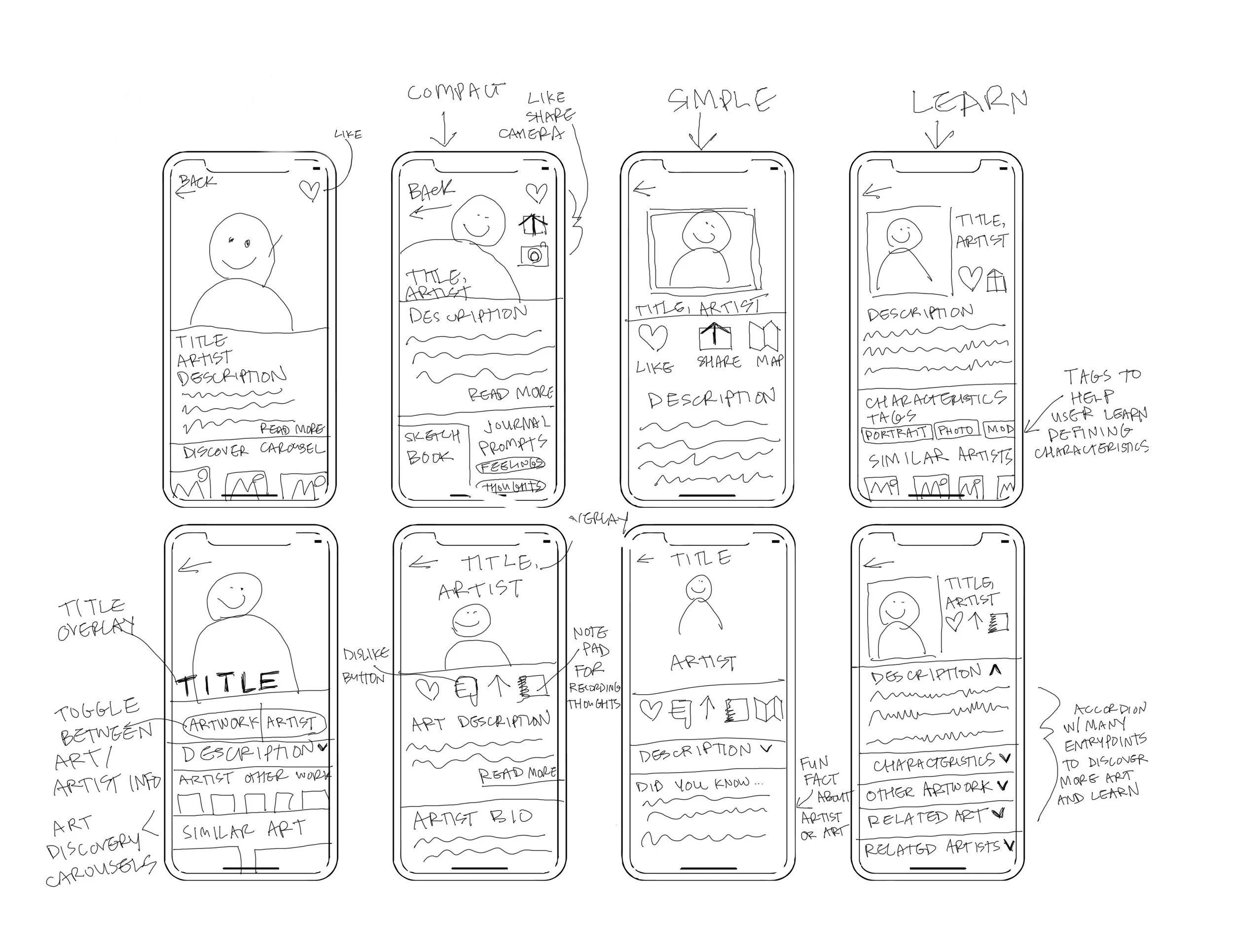
I used a crazy eights exercise to quickly ideate on potential screen designs for the artwork summary card — the prototype’s core interaction.
I also made a solution sketch to visualize the interactions that preceded and followed the summary card, and a storyboard to contextualize the user’s journey from art viewing to app use.
-
Based on my lightning demo research, I knew that I wanted to adhere to app genre conventions and include the primary artwork card UI elements: hero artwork image, title, artist name, and artwork description. I also knew I wanted to include some of the social and discovery elements.
The challenge I wanted to explore with this screen was how to include these elements while minimizing cognitive load.
-
The solution sketch contextualized the actions that preceded and followed the artwork summary card.
Search → Artwork Summary Card → Favorites
Search: I modeled the search screen on Instagram for two reasons: 1, it combines the utility of a search function with discovery elements (text prompts and image tiles), encouraging users to engage more deeply with the content. 2, by leveraging the UI of a popular app that users are likely familiar with, I can leverage existing mental models for image search and reduce cognitive load for new users.
Artwork Summary Card: Sticking with conventions, I prioritized the artwork image, title, and artist name in the first half of the screen. I used an expandable interface to collapse artwork description text to a few lines for two reasons: 1, I wanted to keep description text approachable for users who feel overwhelmed with too much information. 2, I wanted to make room for a discovery element at the bottom of the screen to encourage users to explore related artworks.
Favorites: For users who favorited an artwork, I wanted to give them an opportunity to reflect on it and add their own notes for later. This felt like a good opportunity to empower users to become active rather than passive in their experience of the artwork.
-
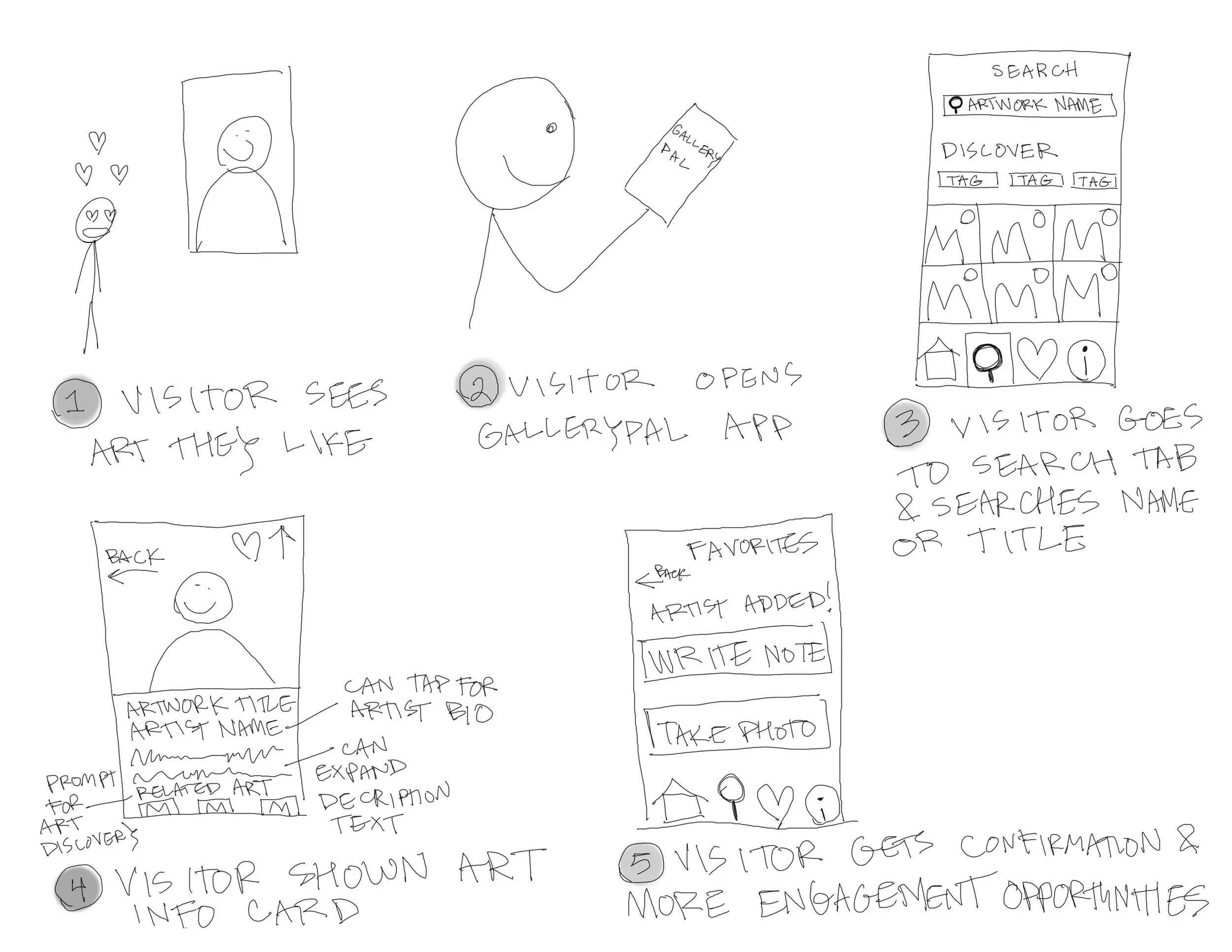
Visitor sees an artwork they like and want to learn more about
Visitor opens app
Visitor searches for art by artwork name, artist name, or art number on wall text
Visitor is shown a card with info about the artwork. Tapping on the artist name will navigate to a bio about the artist. Scrolling down will show related artwork, Tapping the heart will navigate to a “favorites notebook”
When favoriting an artwork, visitor is given the opportunity to add their own notes, observations, reactions as a note attached to the artwork. They are also given the option to add a few of their own photos.
Visitor can view favorited works by tapping the heart in the bottom navigation.

Prototype Design
When fleshing out red route screens for the user flow (centered on the artwork information card), I kept the app’s primary goal in mind: educate users without overwhelming them. This meant meeting users where they are in terms of interest level and preexisting knowledge.
In order to do this, I implemented two main strategies:
Leverage progressive disclosure where content depth is available to keep the experience feeling accessible and not overwhelming.
Prioritize structured, self-guided exploration to boost users’ sense of agency over their learning experience.
-
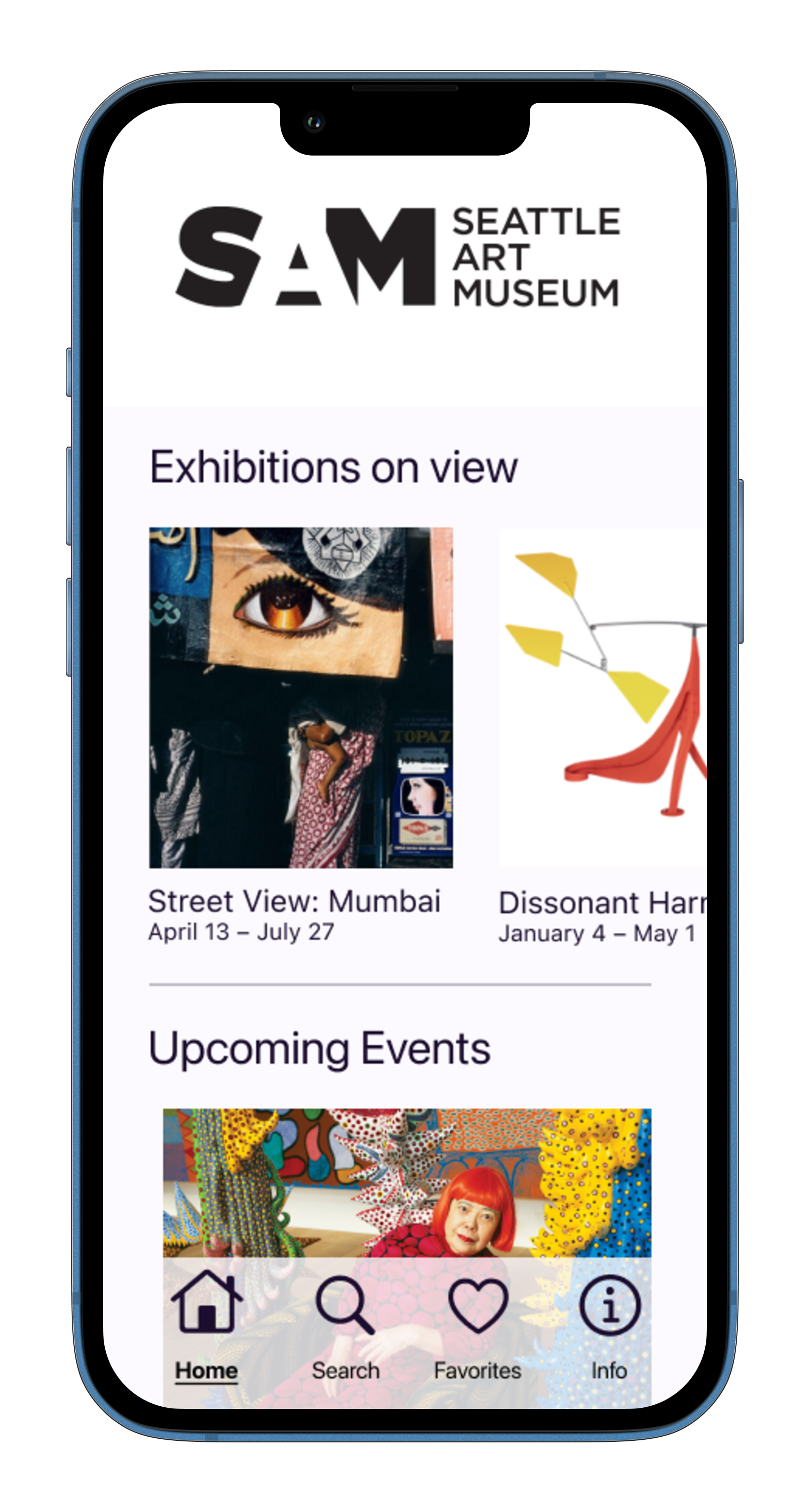
I designed the app’s homepage as a place to inject branding (in this prototype, I used the Seattle Art Museum) and give users a sense of what they’ll experience in the museum space by way of exhibition and event carousels.
-
Search
I made the Search feature accessible from the main navigation bar because it’s essential in helping users find and learn about artworks.
Anticipating that users might not immediately know what to search, I included suggested text “Artist name, artwork name, artwork #” to cue users about searchable terms.
To increase accessibility and offer an alternative to typing, I included a QR code scanner in the top right corner, which could scan a QR code included on artwork wall text.
Discover
To compliment the primary search function, I included a Discover section with both category text prompts and artwork image tiles to facilitate exploration. With this second function, users are educated about the museum’s collection in a way that’s semi-structured and self-guided, which supports the app’s core goal: educate without overwhelming.
-
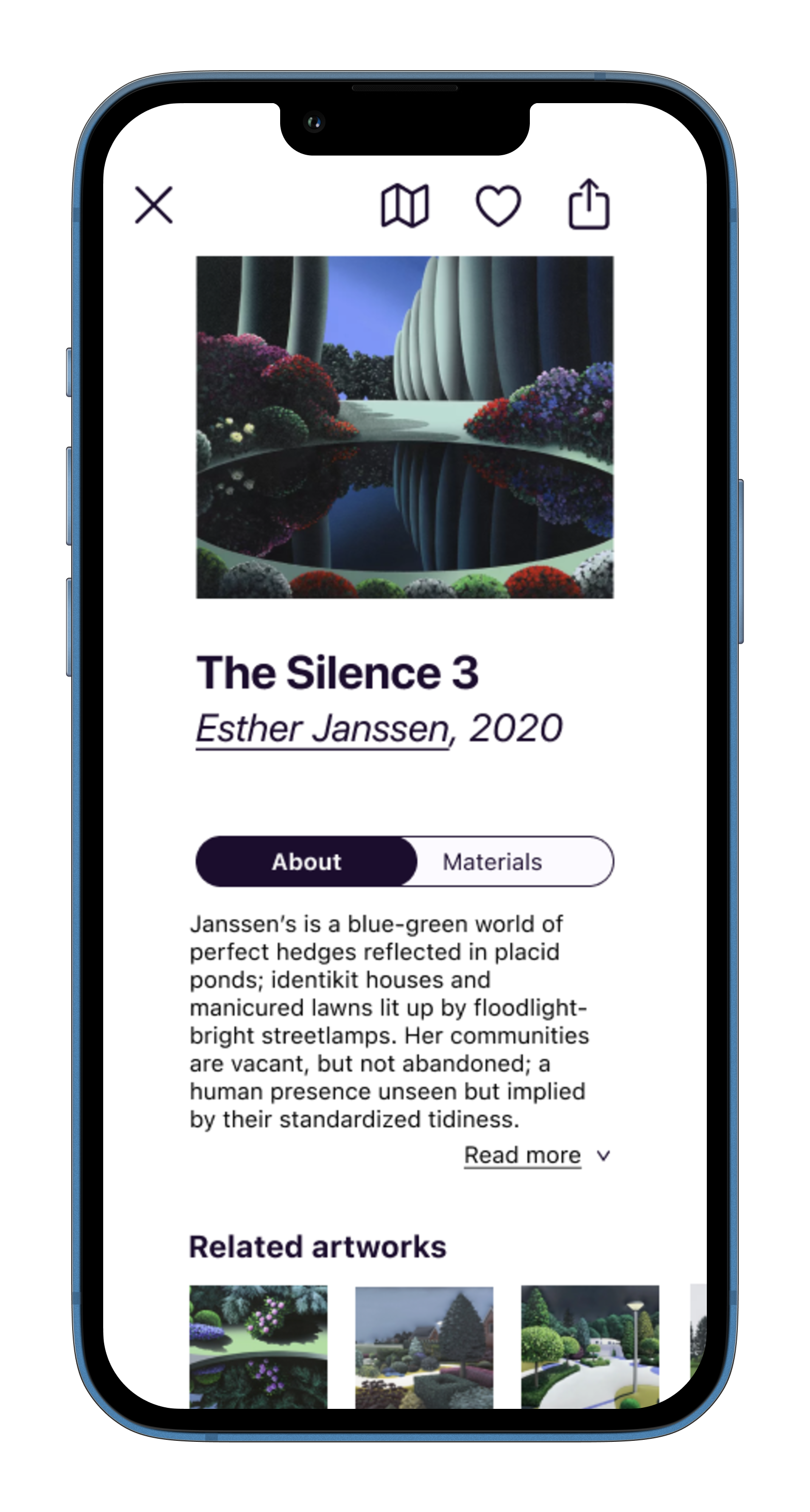
Artwork Info
The artwork card prioritizes simplicity with optional depth. Instead of including summary text about the artwork and artist in a single long text block, I opted for progressive disclosure, breaking the information up into three separate elements:
Art description text is limited to a single, scannable paragraph with the option to “read more” and expand the text.
The artist’s name is tappable and opens a separate Artist Card with more information about the artist.
Technical material details about the work are viewable via a prominent toggle button.
Artwork Interactions
Users are presented with three ways to interact with the artwork via icons at the top right of the hero image: locate, favorite, share. Because users will arrive at artwork cards in the app via the Discover interface (not just while physically standing in front of the work) it was important to include the “locate” option to assist users in finding the physical location of the artwork in the museum space.
Discovery
In order to continue facilitating self-guided exploration of the museum’s art offerings, I included a more fine-tuned version of the Search tab’s Discovery feature. Artworks by the artist and other artists that share stylistic characteristics are suggested at the bottom of the artwork card.
-
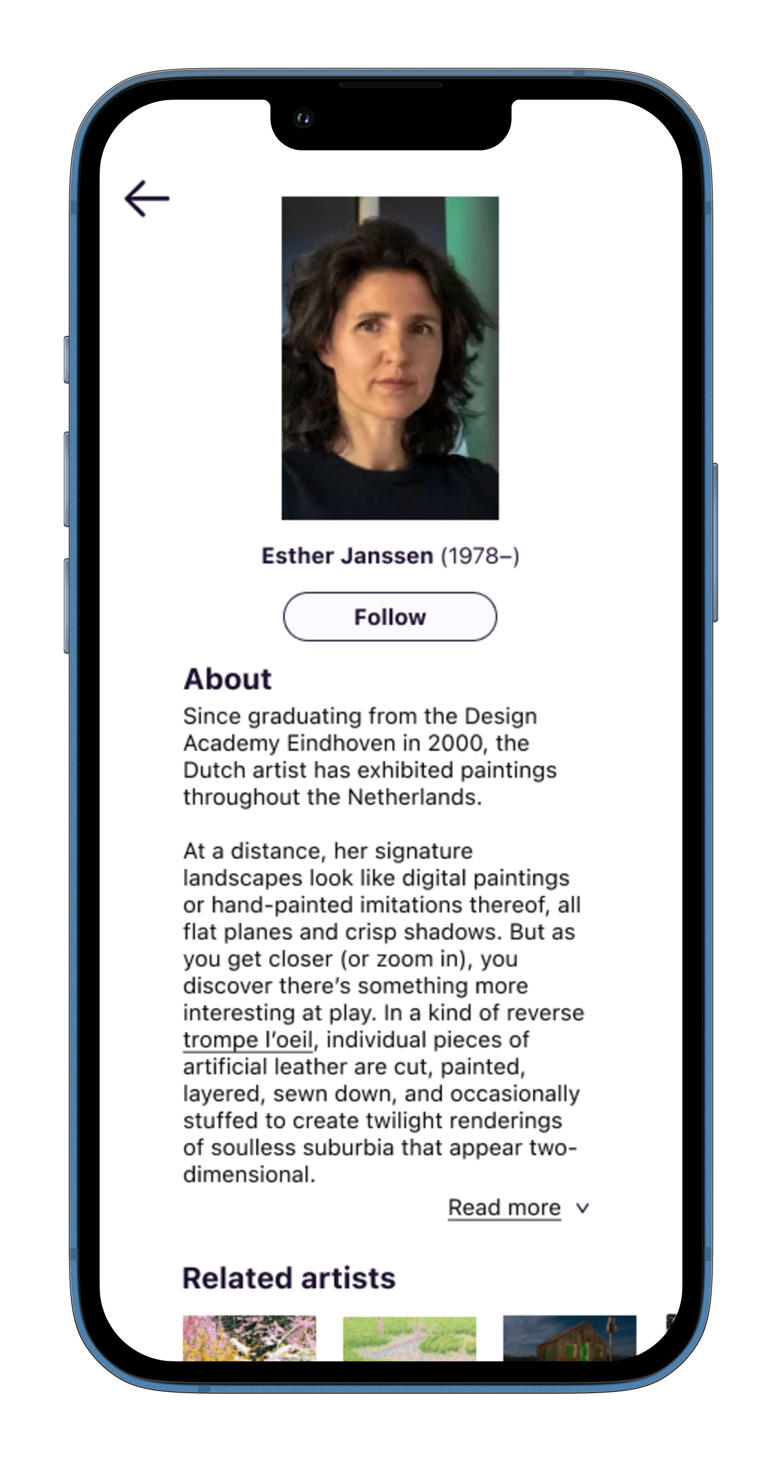
For users who want to learn more about the artist behind the artwork, I created artist cards with similar functionality to the artwork card. The artist’s image, name, and date of birth are shown first, followed by some biographical information with the option to read more. Related artists are presented to invite users to discover artists with similar characteristics.
Like the “favorite” interaction in the artwork card, I included a “follow” button to let users keep track of artists they like. Users could opt into notifications or news from followed artists when they have upcoming exhibitions, works for sale, or other events.
-
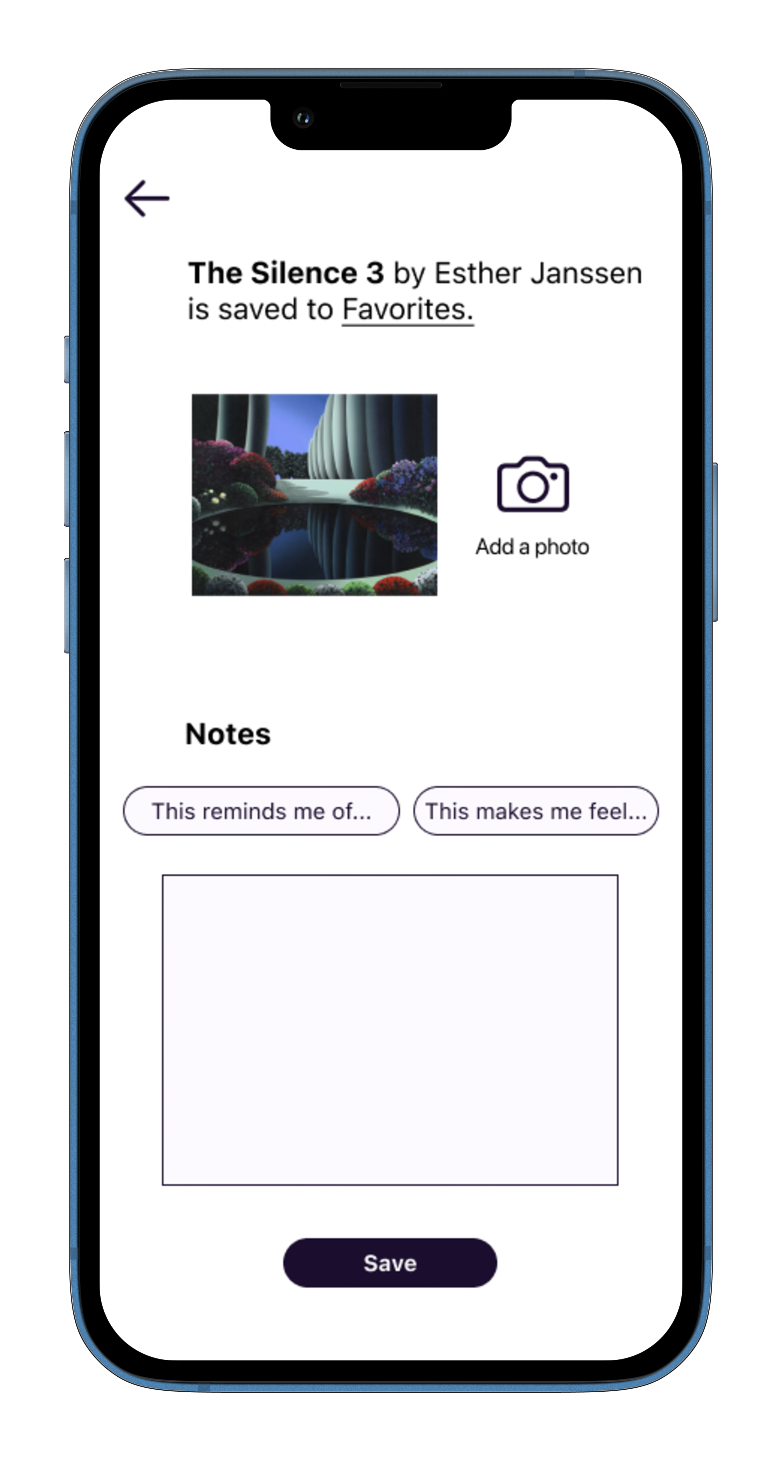
When an artwork is favorited, the user is not only presented with text confirming the action, they are also encouraged to deepen their engagement with the work via the artwork notepad card. Users can use the card to add their own photos of the artwork (selfies, detail shots, etc.) and jot down their reactions and thoughts in the Notes section.
I included a carousel with reflection prompt buttons to make taking notes accessible and guide users who might feel daunted by a blank text box.
-
To help users easily access and keep track of their favorite art and artists, I included the favorites hub in the main bottom navigation. The hub features a toggle to easily view favorite artworks and followed artists.
Home

Search and Discover

Search
Artwork Card
Artist Card
Artwork Notepad

Favorites Hub

Artwork Notepad
Prototype Testing
In 10-15 minute remote prototype testing sessions using a Figma prototype with limited functionality, I prompted five participants to find information about a specific artwork and observed their movements through the search flow to the various artwork-related cards. I asked participants to infer button and icon actions and give feedback on positives and pain points.
-
Session Structure
In each usability test session, I asked participants to imagine that they were in a museum and wanted to find out more about an artwork titled “The Silence 3,” prompting them to engage in search and start the user flow I was testing.
As participants moved through the search flow to the artwork, artist, and favorites cards, I asked them to infer the purpose and action of buttons and icons.
I also asked for feedback on how the UI felt and whether there was anything they found particularly helpful or confusing.
Sessions were 10-15 minutes long.
Participants
I recruited five participants who had visited a gallery or museum at least one time within the past year to ensure that the app was tested by a relevant user group. No other screening criteria was used.
Technology
I used marvelapp.com to animate the prototype’s basic functions and observed participants’ actions via screen sharing on Google Meet.
-
In addition to testing the overall legibility of buttons, icons, and linked text, I had the following research questions:
Do participants understand the Discover section of Search and would they be interested in engaging with suggested content?
Do participants find the Artwork Notepad valuable or cumbersome?
Is the photo feature something they would use or does it feel unnecessary?
Do participants want to see suggestions of related artworks and artists?
Does the text length shown in artwork descriptions feel like the right amount?
Do participants understand how to favorite an artwork, what that means, and where to find favorites later on?
-
The prototype didn’t feature a working keyboard or an artwork database and testing was limited to a single artwork and artist.
Sessions were conducted on desktop computers rather than on phones for two reasons:
1. The prototype was built for a single phone screen size and couldn’t accommodate different mobile devices. This limitation was explained to participants prior to testing.
2. The sessions were conducted remotely. Participants were observed via Google Meet screen sharing.
Results
Overall, participants successfully identified the icons and understood button actions. Participants found the discovery elements helpful but were divided on whether they would use the Artwork Notepad feature. There were no critical usability issues.
The results indicate that there’s an opportunity to improve on the Artwork Notepad feature in future iterations.
-
Do participants understand the Discover section of Search and would they be interested in engaging with suggested content?
Participants intuitively understood Search functionality and found the Discover elements helpful (in Search and in “Related” carousels). Two participants were unsure why certain artworks were being shown and were curious about the characteristics that contributed to recommendations.
One user said, “I like how it does related artwork because I really liked the style of it. So to be able to find more, I think is really cool.” Another said, “I don't really know what to do in a museum, but I know how to use social media… I can guide my way through the museum based on what jumps out to me.”
Do participants find the Artwork Notepad valuable or cumbersome?
Two participants didn’t find the Artwork Notebook feature helpful and didn’t think they would want to use it. One commented, “I would just kind of puzzle over and say, ‘how do I need to feel?’ I don't know.” The other said, “I think it’s nice to have the [notebook] option but I probably wouldn’t have used it.”
Three participants found the Artwork Notebook helpful and said they would use it. One participant said, “Sometimes you just take a lot of pictures when something strikes you as interesting and then forget it. This might be useful because I can revisit [artwork] later on." Another said, “It's like having a docent there with you… That's a really important part about helping people look at art — guiding them into what they like and why.”
Is the photo feature something they would use or does it feel unnecessary?
One participant pointed out that the artwork already had a photo and commented, “It's a little bit confusing that it says add a photo. Why would you add a photo?” The participant was also unsure of the photo storage functionality and whether it would save to the app, their phone, or both.
Another participant who liked the feature said, “Sometimes you just take a lot of pictures when something strikes you as interesting and then forget it. This might be useful because I can revisit [artwork] later on."
Does the text length shown in artwork descriptions feel like the right amount?
Participants liked the amount of text in artwork descriptions, with one saying, “[The artwork description text] feels not too long or too short… I think it's interesting, but I don't know if I would have kept reading past the first thing.”
Do participants understand how to favorite an artwork, what that means, and where to find favorites later on?
All participants understood that tapping the heart icon meant that they were favoriting an artwork and saving it somewhere. One participant was unsure of where to find favorited artwork in the future.
-
Issue 1 (Low Priority)
Photo feature is confusing and feels redundant.
Recommendation: Provide contextual clues to help users understand why they might want to take additional photos of the artwork. Adding photo prompts like “take an art selfie” or “get a shot of your favorite detail” might help.
Issue 2 (Low Priority)
One participant was unsure where to find favorited artworks after tapping the heart icon.
Recommendation: Add explicit linked text to favorite confirmation page like “you can find your favorites here.”
-
![]()
”Sometimes you just take a lot of pictures when something strikes you as interesting and then forget it. This might be useful because I can revisit [artwork] later on."
— Annie
-
![]()
"I like how aesthetically pleasing it is. It actually feels like social media."
— Mike
-
![]()
“It's like having a docent there with you… That's a really important part about helping people look at art — guiding them into what they like and why.”
— Samantha
-
![]()
"I think it's nice to have the [notebook] option but I probably wouldn't have used it."
— Gretta
-
![]()
“[The artwork description text] feels not too long or too short… I think it's interesting, but I don't know if I would have kept reading past the first thing.”
— Abbas


Prototype artwork images and body text credit to: Artsy, Unit London, Seattle Art Museum, Magnum Photos, Wall Street Journal, Nailed Magazine
Persona images credit to: Pexels